| municip | nomgeo | n |
|---|---|---|
| 9 | Milpa Alta | 13 |
| 14 | Benito Juárez | 140 |
| 5 | Gustavo A. Madero | 545 |
| 3 | Coyoacán | 152 |
| 16 | Miguel Hidalgo | 152 |
| 8 | La Magdalena Contreras | 21 |
9 Mapping area data
In this chapter, you will learn how to create crime maps that display data for geographic areas rather than individual crime locations. We will explore how to count crimes within predefined areas, visualize these counts using thematic (choropleth) maps, and understand the challenges of interpreting area-based data. You will also be introduced to interactive maps, crime rate calculations, and important spatial concepts like the ecological fallacy.
Before you start
Open RStudio or – if you already have RStudio open – click Session then Restart R. Make sure you’re working inside the Crime Mapping RStudio project you created in Section 1.4.2, then you’re ready to start mapping.
9.1 Introduction
In previous chapters we have produced maps based on the locations of individual crimes, either showing the individual locations directly on a point map or showing patterns derived from the individual points on a density map. Data that includes the locations of individual crimes is sometimes known as point data because we know the point in space at which each crime occurred.
Another type of crime data is area data. The most common type of area data used for crime mapping is data that does not include the locations of individual crimes but instead consists of counts of the number of crimes occurring in one or more areas. Maps of area data can be useful for several purposes:
- We might want to compare the number of crimes in different areas, such as police districts. We might want to do this to decide which district to allocate extra funds to.
- We might want to estimate the relative risk of a crime occurring in different places by calculating crime rates using counts of crimes and population data for local areas.
- We might only have been given access to counts of crimes for different areas, rather than the location of each crime, perhaps in order to protect the privacy of crime victims.
In all these cases we need to make maps of crimes for areas, rather than showing the locations of individual crimes or the density of crimes generated from datasets of individual crime locations.
Maps that show data for areas are called thematic maps or choropleth maps (in English the word ‘choropleth’ is usually pronounced ‘kor-o-pleth’).

Don’t create area maps unless you need to
Do not aggregate point-level crime data to counts of crimes for areas unless you have a good reason to do so.
Choropleth maps have several shortcomings that we will look at in this chapter. If you have data on the locations of individual crimes then you should typically present those either as individual points (if there are only a few crimes) or using a kernel density map. If you have point-level crime data, you should only use a choropleth map if you need to compare administrative areas or because you want to calculate crime risk and you only have population data for areas.
9.2 Counting crimes
Sometimes we will want to know how many crimes have occurred in different formal areas within a city. For example, we might want to know how many crimes of a particular type had occurred in each neighbourhood in a city as part of a review of the performance of different police teams, or to decide which neighbourhoods should be given more crime-prevention funding.
To calculate counts of crimes for areas, we need
- a dataset representing the crime locations and
- a dataset representing the boundaries of the areas that we want to calculate counts for.
In this chapter, we will count how many car-jacking offences occurred in each alcaldía (borough) of Mexico City in 2019. The result of this will be an SF object containing the outlines of each borough boundary and the count of car-jacking offences in each borough:
What is car jacking?
Car jacking is robbery in which a vehicle is stolen using violence or the threat of violence. If differs from other types of car theft because it involves taking the vehicle from the owner while they are using it, rather than breaking into a car that has been left unattended. Because car jacking involves violence, it is considered more serious than other vehicle-related theft.
9.2.1 Load the data
Open RStudio and make sure you are working inside your Crime Mapping project. Create a new R script file and save it as chapter09a.R file. Write a comment at the top of the file explaining that the script will show the number of car-jacking offences in each alcaldía in Mexico City in 2019.
Add a line to the script file (with an appropriate comment above it) to load the ggspatial, sf, sfhotspot and tidyverse packages. If you need help with that code, look back to Section 2.3.1.
We need two datasets for this script: a dataset of car jackings and one of alcaldía boundaries. In your script file, write the code need to load this dataset into an object called cdmx_car_jacking (CDMX is a common Spanish-language abbreviation for Mexico City, short for Ciudad de México).
https://mpjashby.github.io/crimemappingdata/cdmx_car_jacking.gpkgWhen you are writing this code, think about what sort of file you are trying to load and which function you should use to do it. If you need help, look at Appendix A. Make sure your code has comments that explain what it does.
Now write the code needed to load this dataset and store it in an object called cdmx_alcaldias:
https://mpjashby.github.io/crimemappingdata/cdmx_alcaldias.gpkgOnce you have written the code to load the packages and data, click the ‘Solution’ button below to check you code.
chapter09a.R
# This file creates a choropleth map of counts of car-jacking offences in Mexico
# City in 2019

# Load packages
pacman::p_load(ggspatial, sf, sfhotspot, tidyverse)

# Load CDMX car-jacking data
cdmx_car_jacking <- read_sf("https://mpjashby.github.io/crimemappingdata/cdmx_car_jacking.gpkg")

# Load CDMX borough boundaries
cdmx_alcaldias <- read_sf("https://mpjashby.github.io/crimemappingdata/cdmx_alcaldias.gpkg")
9.2.2 Count crimes in each borough
Now that we have loaded our data, the next step is to count the number of offences in each borough and produce an R object that contains the boundaries of the boroughs together with the number of offences in each one. We can use the hotspot_count() function from the sfhotspot package to do this.
By default, hotspot_count() produces counts of points in cells in a grid (we saw this when we used hotspot_kde() in Chapter 6). This is often useful, but in this case we instead want to produce a count for each alcaldía. To do that, we can pass the cdmx_alcaldias object to the grid argument of hotspot_count(). Add this code to your script file:
Run this code now. When you run it, you will see warnings appear in the R Console:
Warning in hotspot_count(cdmx_car_jacking, grid = cdmx_alcaldias): `data` has points with the co-ordinates "0, 0".
ℹ This usually indicates a problem with the data.
ℹ Check co-ordinates are correct (e.g. by mapping them).
Warning: 152 point is outside the area covered by the supplied polygons.This means that some of the points in the cdmx_car_jacking object are outside the area covered by the cdmx_alcaldias object. This is a common issue with crime data. Sometimes the authorities for an area (e.g. the police agency for a city) will record a small number of crimes that occurred outside their area of responsibility if they are linked to a larger series of crimes they are investigating. On other occasions points will appear outside the area we would expect due to processing errors.
If any error happened before you were given the data, there is probably little you can do to fix it. But it is still important to check to make sure you understand why there is a problem with the data. We can usually do that by producing a very basic map showing the data we are using on a base map.
Run this code in the R Console:
Loading required namespace: raster
This map shows that the points in the cdmx_car_jacking dataset are located in two parts of the world, which is not what we would expect. Some points appear in Mexico as we would expect, but some appear in the Gulf of Guinea off the coast of West Africa. These points are located on ‘Null Island’, which we will learn more about in Section 12.3.4.
For now, we can make a judgement that since only a small proportion of points are outside the boundary of Mexico City (152 out of 2811, or 5%), they are unlikely to substantially affect the overall patterns of car jacking we are interested in. This means we can safely continue, ignoring the rows in the data that have locations of outside Mexico City.
Check your knowledge: Counting crimes
Which of the following is not a common reason why crime analysts might choose to count the number of crimes in different areas?
What is a choropleth map?
Which of the following is not a reason some crime locations might be recorded outside the area covered by the agency doing the crime recording?
9.3 Mapping areas
Maps showing data (such as counts of crimes) for different areas are extremely common in all types of spatial analysis. Watch this video to find out introduce yourself to some of the issues you should be aware of when mapping areas.
Quiz
What is a choropleth map?
Why is statistical data often published for areas rather than individual streets?
What is the ecological fallacy?
What is the key mistake people often make when interpreting choropleth maps?
Because so much of the data that we might use in crime mapping is only available for pre-defined areas, we often have no choice as to what types of area we use to produce our maps. But whether we choose the areas or not, we have to be mindful that data for areas can only tell us about the area as a whole, not individual people or places within that area. Assuming information about areas applies to individual people or places within them is known as the ecological fallacy, a type of logical error that can be dangerous when we try to draw conclusions from choropleth maps.
Important
The ecological fallacy is not a problem that we can solve – it is inherent to choropleth maps. For this reason, whenever we plan to show some spatial data using a choropleth map, it is worth stopping and thinking about whether another type of map (such as a density map) might show the data more effectively and without the problems that choropleth maps have.
Nevertheless, in some circumstances a choropleth map will be the best choice either because we only have data for pre-defined areas or because we are specifically interested in comparing areas (e.g. in working out if there is more crime in one neighbourhood or police district than another).
We have already loaded the data we need to create a map of car jackings in Mexico City, and counted how many offences occurred in each alcaldía. The car_jacking_counts object we created is an SF object, which means we can use geom_sf() to plot it on a map.
chapter09a.R

There are at least two problems with this map:
- we cannot tell how many murders there were in each alcaldía, and
- we cannot see the base map under the polygons representing the alcaldías.
We can solve these two problems by changing the aesthetics for the geom_sf() layer in our code. Specifically, we can make the alcaldía polygons semi-transparent by setting the alpha argument to geom_sf() to a value of less than one, while also using aes(fill = n) to specify that the fill colour of the polygons should depend on the number of car jackings in each alcaldía. At the same time we will use scale_fill_distiller() to use a colour scheme that is accessible to the widest range of users.
chapter09a.R
ggplot(car_jacking_counts) +
  annotation_map_tile(type = "cartolight", zoomin = 0, progress = "none") +
  # Add the alcaldía layer with colour controlled by the number of crimes
  geom_sf(aes(fill = n), alpha = 0.67) +
  # Use a better colour scheme than the default
  scale_fill_distiller(palette = "Oranges", direction = 1) +
  # Add some labels
  labs(
    title = "Car jacking incidents in alcaldías in Mexico City, 2019",
    fill = "number of\noffences",
    caption = "Data from OpenStreetMap"
  ) +
  theme_void()
We could build on this map in several ways. For example, in Section 9.5 we will learn how to show crime rates on a map, as an alternative to crime counts. But in the next section, we will learn how to make interactive crime maps.
9.4 Making an interactive map
So far in this course, all the maps we have made using ggplot() have been static images. These are useful for lots of different circumstances, and are usually the only choice if we want to produce a written report as a Word document or PDF. But in some circumstances it may be useful to produce a map that you can interact with by zooming in or panning around different areas. This can be useful when readers might want to look at areas of the map in more detail than is possible without zooming in.
In this section we will make an interactive map of counts of murders in each district in the state of Uttar Pradesh in northern India in 2014. Uttar Pradesh is the largest state in India, with more than 200 million residents.
9.4.1 Combining datasets
Restart R by opening the Session menu in RStudio and clicking Restart R. Open a new R script file in RStudio and save it as chapter09b.R. Paste the following code into this file and run it.
chapter09b.R
# This file creates an interactive map of counts of murders in Uttar Pradesh,
# India, in 2014

# Load packages
pacman::p_load(leaflet, sf, tidyverse)

# Load number of murders in each district
murders <- read_csv("https://mpjashby.github.io/crimemappingdata/uttar_pradesh_murders.csv")

# Load district boundaries
districts <- read_sf("https://mpjashby.github.io/crimemappingdata/uttar_pradesh_districts.gpkg")
You can see from this code that we are loading two datasets:
- a CSV file called
uttar_pradesh_murders.csvcontaining counts of murders in each district, and - a geopackage file called
uttar_pradesh_districts.gpkgcontaining the boundaries of each district.
To start, let’s look at the two datasets in the R Console:
# A tibble: 6 × 2
  district       murder
  <chr>           <dbl>
1 Agra              178
2 Aligarh           179
3 Allahabad         132
4 Ambedkar Nagar     24
5 Amethi             36
6 Amroha 60Simple feature collection with 6 features and 2 fields
Geometry type: POLYGON
Dimension: XY
Bounding box: xmin: 77.42308 ymin: 24.80419 xmax: 82.35455 ymax: 28.90105
Geodetic CRS: WGS 84
# A tibble: 6 × 3
state district_name geom
<chr> <chr> <POLYGON [°]>
1 Uttar Pradesh Agra ((77.6444 27.23444, 77.65405 27.23463, 77.65336 2…
2 Uttar Pradesh Bareilly ((78.97474 28.41527, 78.97981 28.41454, 78.98546 …
3 Uttar Pradesh Etah ((79.20766 27.56734, 79.20418 27.56314, 79.19801 …
4 Uttar Pradesh Shahjahanpur ((80.30972 28.46321, 80.29755 28.46668, 80.28367 …
5 Uttar Pradesh Pilibhit ((79.67865 28.84923, 79.67203 28.83937, 79.67553 …
6 Uttar Pradesh Allahabad ((81.54684 25.1848, 81.55587 25.1857, 81.5577 25.…This output shows us that both datasets include a column that contains the name of each district in Uttar Pradesh. In the murders dataset that column is called district while in the districts dataset that column is called district_name. We can also see that only the murders object contains a count of murders in each state (in the murder column) and only the districts object contains the outlines of each district boundary (in the geom column). To make a choropleth map of the murder counts, we will need to join the two datasets so we have a single SF object that contains all the data we need.
There are several ways to join data in R. In this case, we want to join the two datasets based on the value of a column in both datasets that stores the same information (in this case, the district names). To do that we use the left_join() function, one of a family of joining functions in the dplyr package that join two objects together based on the values of particular columns.
To understand how left-joins work, imagine we had two datasets called x and y:

We could use left_join(x, y) to merge them into one combined dataset. This function has left in the name because it joins the two datasets by adding matching rows from the right-hand dataset (y) to each row in the left-hand dataset (x). This means the combined dataset will include all the rows from x (the left-hand dataset), but only the rows from y that match rows in x. Rows in y that do not match any rows in x will be discarded.
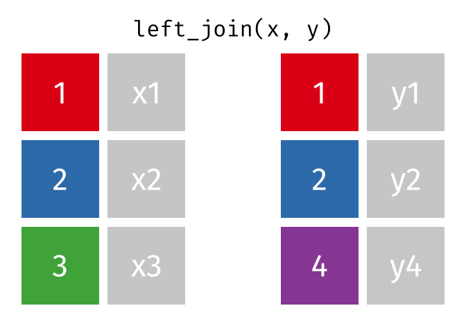
In our case, we want to join the murders and districts objects so that the combined dataset includes exactly one row for each district in districts, even if no murders occurred in that district (which might mean that district is not present in the murders dataset). Since we want to keep all the rows from districts, we use that object as the first argument to left_join(), i.e. left_join(districts, murders). If there are any rows in the right-hand object murders that do not match any rows in the left-hand object districts, those rows will be discarded from the result.
By default, left_join() will match the rows in the districts and murders objects using all the column names that are present in both datasets. This can sometimes have unexpected results, so it is safer to specify which columns we want to match to be based on using the by argument to left_join(). There are lots of ways we could join two datasets, so we will use the join_by() helper function to assist with this.
Copy this code into your script file and run it.
To check the result produced by this code, run head(district_murders) in the R Console. The output should look like this:
Simple feature collection with 6 features and 3 fields
Geometry type: POLYGON
Dimension: XY
Bounding box: xmin: 77.42308 ymin: 24.80419 xmax: 82.35455 ymax: 28.90105
Geodetic CRS: WGS 84
# A tibble: 6 × 4
state district_name geom murder
<chr> <chr> <POLYGON [°]> <dbl>
1 Uttar Pradesh Agra ((77.6444 27.23444, 77.65405 27.23463, 77.… 178
2 Uttar Pradesh Bareilly ((78.97474 28.41527, 78.97981 28.41454, 78… 132
3 Uttar Pradesh Etah ((79.20766 27.56734, 79.20418 27.56314, 79… 65
4 Uttar Pradesh Shahjahanpur ((80.30972 28.46321, 80.29755 28.46668, 80… 88
5 Uttar Pradesh Pilibhit ((79.67865 28.84923, 79.67203 28.83937, 79… 54
6 Uttar Pradesh Allahabad ((81.54684 25.1848, 81.55587 25.1857, 81.5… 132If you want to view the whole dataset, run View(district_murders) in the R Console instead. You can see that district_murders contains all the columns from the districts object and the murder column from the murders dataset. It does not contain the district column from the murders dataset, since this has been merged into the existing district_name column.
Joining datasets in any programming language (or even using functions like VLOOKUP() in Microsoft Excel) can be complicated. It is particularly important that you understand in each case (a) which dataset you are going to merge data into (in this case, districts), (b) which dataset columns are going to be taken from (in this case, murders) and (c) which columns are going to be used as the basis for the join (in this case, district_name and district). Thinking about what you are trying to achieve when joining datasets before you write the necessary code will save a lot of issues later on.
Do not ignore warnings produced by
left_join()
Because joining datasets can be complicated, left_join() will produce warning messages when it detects that you might have made a mistake in specifying how two datasets should be joined. It is not safe to ignore these warnings. If left_join() produces a warning, make sure you understand exactly what the warning is about and if you cannot fix it then get help using the techniques we learned about in Chapter 8.
9.4.2 Interactive choropleth maps
Static maps (and other types of chart) in R are made using the ggplot2 package. But interactive maps are made using a different package: leaflet. The functions in the leaflet package work in a similar way to ggplot2, but with a few differences.
To make maps with leaflet, we create a stack of functions in a similar way to the ggplot() stacks we have already created. Note that while the concept of a stack is similar, we cannot use functions from the ggplot2 package in a leaflet stack, or vice versa. Also, we construct leaflet stacks using the pipe operator |> rather than the plus operator + that we use in ggplot2.
We can create a very basic leaflet map using the leaflet() function to create the stack, the addProviderTiles() function to add a base map and the addPolygons() function to add the district outlines. We have already loaded the leaflet package in our script file, so we can run this code in the R Console to create our first interactive map.
R Console
You can interact with this map by clicking the buttons to zoom in and out, and by moving around the map area. For example, you can zoom out to see where Uttar Pradesh is relative to other places, or zoom in to see where particular cities are within Uttar Pradesh. This could be very useful in helping people understand the context of crime data.
In this map we use the CartoDB.Voyager style of base map, but leaflet can use a large number of different base maps that you can view in this online gallery.
However, this map isn’t very useful because it doesn’t show how many murders there were in each district. To do that, we need to specify that each district should be coloured according to the values in the murder column of the district_murders object. With a ggplot() map, we would do this with a function such as scale_fill_distiller(), but with a leaflet map the code we need is slightly more complicated and has two separate stages.
The first stage is to create a custom function that converts the values in the murder column of the district_murders objects into colours. To do this, we use the colorNumeric() function from the leaflet package. Yes, this means that we are using a function to create a function, which we will then later use to set an argument of another function – programming languages are very powerful, but that sometimes means they are complicated.
The colorNumeric() function (note the spelling of “color”) allows us to specify the colour scheme we want using the palette argument. We also have to set the domain argument to be NULL. The palette argument to the colorNumeric()function accepts the same values as the palette argument to the scale_fill_distiller() function from ggplot2:

To create the custom colour palette function, we use the <- operator to assign the result produced by colorNumeric() to a name, just as we would with an object. We can give this custom function any name we like, but in the code below we’ll call it colours_red.
Once we have created a custom colour palette function using colorNumeric(), we can use that function to create the appropriate values for the fillColor argument of the addPolygons() function in our existing leaflet stack. Since we want the map colours to be controlled by the murder column in the district_murders object, we specify murder as the only argument to the colours_red() palette function we have created.
Let’s see this in action: add this code to the chapter09b.R script file:
chapter09b.R
# Create a custom colour palette function
colours_red <- colorNumeric(palette = "Reds", domain = NULL)
# Create interactive map
leaflet(district_murders) |>
# Add base map
addProviderTiles("CartoDB.Voyager") |>
# Add district polygons coloured by number of murders
addPolygons(
fillColor = ~ colours_red(murder),
fillOpacity = 0.75,
weight = 2,
color = "black"
)fillColor needs a tilde
One slight quirk of leaflet is that in order for colours_red() to have access to the columns in the district_murders object, we need to add a tilde (~) symbol before the function name, so that the fillColor argument is fillColor = ~ colours_red(murder) rather than fillColor = colours_red(murder). If you forget add do the ~, you will see an error saying:
There are three improvements we can make to this interactive map. The first is to add a legend, using the addLegend() function. addLegend() needs three arguments:
palspecifies which custom palette function controls the legend colours. This should be the same function as used in thefillColorargument of theaddPolygons()function.valuesspecifies which column in the data the legend will show. Once again, the column name should be preceded by a~operator.titlespecifies the legend title.
Change the code in your script file to add the addLegend() function to the end of the stack:
chapter09b.R
# Create interactive map
leaflet(district_murders) |>
# Add base map
addProviderTiles("CartoDB.Voyager") |>
# Add district polygons coloured by number of murders
addPolygons(
fillColor = ~ colours_red(murder),
fillOpacity = 0.75,
weight = 2,
color = "black"
) |>
# Add legend
addLegend(pal = colours_red, values = ~ murder, title = "number of murders")Next, we can add an inset map in the corner of the main map. This is useful for interactive maps because if we zoom in to show only a small area, we will be able to use the inset map to stay aware of the wider context.
We can do this by adding the addMiniMap() function to the leaflet stack. We will add the argument toggleDisplay = TRUE to add the ability to minimise the inset map if necessary.
Update the leaflet stack in chapter09b.R again to add the call to addMiniMap():
chapter09b.R
# Create interactive map
leaflet(district_murders) |>
# Add base map
addProviderTiles("CartoDB.Voyager") |>
# Add district polygons coloured by number of murders
addPolygons(
fillColor = ~ colours_red(murder),
fillOpacity = 0.75,
weight = 2,
color = "black"
) |>
# Add legend
addLegend(
pal = colours_red,
values = ~ murder,
title = "number of murders"
) |>
# Add inset map
addMiniMap(toggleDisplay = TRUE)Finally, we can add labels to the districts, which will appear when we move the pointer on a screen over a particular district. We do this by adding the label argument to the existing addPolygons() function. As with the previous sections, we can specify that the labels should be based on the district_name column in the district_murders data using the ~ operator, by setting label = ~ district_name.
Change the existing call to addPolygons() to add the district labels:
chapter09b.R
# Create interactive map
leaflet(district_murders) |>
# Add base map
addProviderTiles("CartoDB.Voyager") |>
# Add district polygons coloured by number of murders
addPolygons(
fillColor = ~ colours_red(murder),
fillOpacity = 0.75,
label = ~ district_name,
weight = 2,
color = "black"
) |>
# Add legend
addLegend(
pal = colours_red,
values = ~ murder,
title = "number of murders"
) |>
# Add inset map
addMiniMap(toggleDisplay = TRUE)Now we have added the extra layers to the map, it is easy to see which district had the highest number of murders and (by clicking on it) what the name of that district is.
The script file chapter09b.R should look like this:
chapter09b.R
# This file creates an interactive map of counts of murders in Uttar Pradesh,
# India, in 2014
# Load packages
pacman::p_load(leaflet, sf, tidyverse)
# Load number of murders in each district
murders <- read_csv("https://mpjashby.github.io/crimemappingdata/uttar_pradesh_murders.csv")
# Load district boundaries
districts <- read_sf("https://mpjashby.github.io/crimemappingdata/uttar_pradesh_districts.gpkg")
# Join murder counts to district boundaries
district_murders <- left_join(
  districts,
  murders,
  by = join_by(district_name == district)
)
# Create a custom colour palette function
colours_red <- colorNumeric(palette = "Reds", domain = NULL)
# Create interactive map
leaflet(district_murders) |>
  # Add base map
  addProviderTiles("CartoDB.Voyager") |>
  # Add district polygons coloured by number of murders
  addPolygons(
    fillColor = ~ colours_red(murder),
    fillOpacity = 0.75,
    label = ~ district_name,
    weight = 2,
    color = "black"
  ) |>
  # Add legend
  addLegend(
    pal = colours_red,
    values = ~ murder,
    title = "number of murders"
  ) |>
  # Add inset map
  addMiniMap(toggleDisplay = TRUE)
Check your knowledge: Interactive maps
Why might a static crime map be preferred over an interactive map?
Which of these statements is true about the relationship between the ggplot2 and leaflet packages?
What is one advantage of interactive crime maps?
9.5 Calculating crime rates
The map of murders in Uttar Pradesh has a major limitation: it counts murders at district level, but it does not take into account that the number of people living in each district is different. For example, the district of Allahabad has a population of 6.0 million while the district of Mahoba has a population of 0.9 million. It’s therefore not surprising that some districts have more murders than others.
When we have crime counts for areas of different sizes, it is often more useful to map crime rates instead of crime counts. A crime rate is an expression of the frequency of crime that in some way controls for the population that is exposed to crime. We often use choropleth maps for this because we typically only have population counts for areas, rather having access to data on where each individual person lives.
9.5.1 Types of crime rate
There are three common types of crime rate, each of which measures risk in a different way. The most common, and the type of rate that people almost always mean if they talk about a ‘crime rate’ without specifying another type, is the incidence rate. This is the number of crimes in an area divided by the number of people, households or places against which a crime could occur. For example, the incidence rate of burglary in an area might be calculated as the number of crimes per 1,000 households, while the incident rate of homicide might be expressed as the number of homicides per 100,000 people.
\[ \textrm{incidence} = \frac{\textrm{crimes}}{\textrm{population}} \]
Incidence rates and counts are each useful in different circumstances. For example, if you were advising a police commander on which district to allocated more homicide detectives to, the number of murders in a district is probably more useful than the incidence rate. But the opposite would be true if you were advising a politician on which district to add extra funding to for homicide prevention, since in that case you would probably want to focus on areas with the highest risk of homicide.
‘Incidence’ vs ‘incident’
In crime analysis, you will hear people use two very similar terms that have different meanings. When a crime analyst talks about ‘incidence’ they almost always mean ‘incidence rate’ as defined above. But when they talk about ‘incidents’ they are usually talking about the count of offences. So when you hear a crime analyst say ‘which area has the highest incidents?’, they mean which has the highest number, not the highest rate. But if they say ‘which area has the highest incidence?’, they mean the highest rate.
Incidence rates are useful for comparing areas with each other, but they tell us a little about how likely an individual person is to be a victim of crime because crime is heavily concentrated against a few victims (think back to the law of crime concentration we discussed in Chapter 1). To understand the average risk of an individual person being a victim of crime once or more, we calculate the prevalence rate. This is the number of people, households, etc. who were victims at least once, divided by the total number of people, households, etc. in the area. Prevalence rates are usually expressed as a percentage, so we might say that 1% of the population has been a victim of a particular crime at least once during a year.
\[ \textrm{prevalence} = \frac{\textrm{victims}}{\textrm{population}} \]
The final type of rate is the concentration rate. This tells us how concentrated crime is, and is usually expressed as a single number, e.g. if the concentration rate for a crime is 2.5 then we can say that everyone who was a victim of that crime at least once was on average victimised 2.5 times. This is particularly useful for understanding how important repeat victimisation is to driving up the frequency of crime in an area. This, in turn, might lead us to focus crime-prevention efforts on work to protect recent victims of crime from being victimised again.
\[ \textrm{concentration} = \frac{\textrm{crimes}}{\textrm{victims}} \]
Crime rates are averages
All three types of crime rate are average values for an area as a whole, so we are always at risk of committing the ecological fallacy. Remember that while rates are useful for describing areas, that does not imply everyone in an area faces the same risk from crime.
9.5.2 Choosing a population measure
To calculate a crime rate, we need to be able to measure the population that is at risk from that crime. It is very common for analysts to calculate rates based on the number of people who live in an area, not least because that information is often easily available. However, there are many situations in which the residential population of an area is a poor measure of the population at risk for crime there. For example:
- Robberies in a shopping area where most of the victims do not live in the area but instead travel from elsewhere to go shopping. This can lead to vastly inflated crime rates for commercial and entertainment districts that have very small residential populations but very large numbers of people coming into the area to work, shop or visit. Crime rates based on residential population almost always give misleading rates for city centres, airports or business districts.
- Assaults on public transport where victims happen to be passing through a given area at the time they are victimised but are doing so as part of a longer journey through several areas, with the crime potentially occurring in any one of them. These crimes are known as interstitial offences.
- Residential burglaries where the targets of crime are homes, not people, so the crime rate may be influenced by the number of people in each household.
In all these cases, the residential population is a poor measure of the population at risk from crime. Unfortunately, other measures of population (such as counts of people on public transport or walking along a shopping street) are often expensive or difficult to obtain. This is known as the denominator dilemma: should we use residential population to calculate crime rates just because it is the only data that is available?
9.5.3 Calculating murder rates in Uttar Pradesh
In the case of murder in Uttar Pradesh, residential population is likely to be an acceptable (although not perfect) denominator to use in calculating an incidence rate. This is because Indian districts are relatively large areas and so we can expect that most murder victims will be killed in the district where they live (because people everywhere tend to spend most of their time close to where they live). However, there will definitely be exceptions to this, with people being murdered in a different district to where they live. Working out the extent of this problem would be an important question for a detailed investigation into murder in Uttar Pradesh, but we will not consider it any further here.
To calculate an incidence rate, we once again need to join two datasets together. This time, we need to add a dataset of population data for districts in Uttar Pradesh. Add this code to your script file just after the lines that load the other two datasets:
If we look at the column names in this new dataset, we will see that includes a column called district that contains the district names. Just as we did before, we can use the left_join() function to add the columns from the district_pop dataset to the combined dataset we have already produced. To do that, let’s create a pipeline that combines all the datasets one after the other:
Add this code to your script file in place of the previous code that joined together the districts and murders datasets. Now look at the new district_murders object you’ve just created:
Simple feature collection with 6 features and 9 fields
Geometry type: POLYGON
Dimension: XY
Bounding box: xmin: 77.42308 ymin: 24.80419 xmax: 82.35455 ymax: 28.90105
Geodetic CRS: WGS 84
# A tibble: 6 × 10
state district_name geom murder code headquarters
<chr> <chr> <POLYGON [°]> <dbl> <chr> <chr>
1 Uttar Prade… Agra ((77.6444 27.23444, 77.6… 178 AG Agra
2 Uttar Prade… Bareilly ((78.97474 28.41527, 78.… 132 BR Bareilly
3 Uttar Prade… Etah ((79.20766 27.56734, 79.… 65 ET Etah
4 Uttar Prade… Shahjahanpur ((80.30972 28.46321, 80.… 88 SJ Shahjahanpur
5 Uttar Prade… Pilibhit ((79.67865 28.84923, 79.… 54 PI Pilibhit
6 Uttar Prade… Allahabad ((81.54684 25.1848, 81.5… 132 AH Allahabad
# ℹ 4 more variables: division <chr>, population <dbl>, area <dbl>,
# density_km2 <dbl>As with the result of the previous join, you can see that the district_murders object contains all the columns from the districts object, followed by the murder column from the murders dataset and then all the columns from the district_pop object except the district column.
Now that we have a single dataset containing all the variables we need, we can calculate the incidence of murders per 100,000 people. To do that, we can add another line of code to the end of the pipeline we have just created. Update your script file with this code:
chapter09b.R
# Join murder counts and population to district boundaries
district_murders <- districts |>
# Join murder counts
left_join(murders, by = join_by(district_name == district)) |>
# Join population counts
left_join(district_pop, by = join_by(district_name == district)) |>
# Calculate murder rate
mutate(murder_rate = murder / (population / 100000))9.5.4 Mapping crime rates
To create a choropleth map of the murder rate using leaflet, we simply use the code from our previous interactive map but specify that the murder_rate column be used to determine the colour of each district polygon rather than the murder column. We will also change the base map to a different style.
Be clear about how you have calculated the crime rate shown on a map
Whenever we map a crime rate, it is important that we are explicit about how that rate was calculated. For example, using a legend title such as “rate of murders” would not give enough information to allow readers to understand how to interpret the map. A much better legend title would be “murders per 100,000 residents” or something similar.
Whenever we need to use a longer legend title, or other text, it can be useful to break the text over multiple lines. Since leaflet maps are built using the same technologies as web pages, the way we wrap text is slightly different to how we do it for maps created with ggplot2. Rather than using the new-line character (\n) or the str_wrap() function, we will instead use the HTML new-line separator <br> and wrap the whole legend title in the HTML() function from the htmltools package.
Replace the existing map code in the chapter09b.R script file with this code. Then read through the notes below this code to understand how it is different from the code that produced the previous interactive map.
chapter09b.R
# Create interactive map
leaflet(district_murders) |>
# Add base map
addProviderTiles(
1 "Esri.WorldImagery",
2 options = providerTileOptions(opacity = 0.3)
) |>
# Add district polygons coloured by number of murders
addPolygons(
3 fillColor = ~ colours_red(murder_rate),
fillOpacity = 0.75,
label = ~ district_name,
weight = 2,
color = "black"
) |>
# Add legend
addLegend(
pal = colours_red,
values = ~ murder_rate,
4 title = htmltools::HTML("murders per<br>100,000 residents")
) |>
# Add inset map
addMiniMap(toggleDisplay = TRUE)- 1
- This map uses a different style of base map to the previous map.
- 2
- The base map style used in this map is quite colourful, so we will make it semi-transparent to reduce its visual prominence.
- 3
-
We want the map colour scheme to be controlled by the
murder_ratecolumn in thedistrict_murdersdataset. - 4
- We use the map legend title to specify how the murder rate was calculated.
We now have all the code we need to load the necessary data, calculate crime rates and make an interactive map of murders in districts in Uttar Pradesh.
Check your knowledge: Mapping crime rates
What is the main difference between crime counts and crime rates?
What type of rate describes the chances of a person being a victim of a crime at least once in a given period?
What type of rate describes the frequency of crime after controlling for some measure of the population at risk?
What type of rate describes the average number of times each victim of a particular crime is victimised?
Why is choosing the right population measure important when calculating crime rates?
9.6 In summary
In this chapter we have learned how to calculate the number of points in different areas, join different sources of data together, and map both crime counts and crime rates on both static and interactive maps.
We have also learned about two disadvantages of choropleth maps: the ecological fallacy and the modifiable areal unit problem.
Your script file chapter09b.R should now look like this. Save this file so that you can use it as a template when you want to create interactive maps in future.
chapter09b.R
# This file creates an interactive map of counts of murders in Uttar Pradesh,
# India, in 2014
# Load packages
pacman::p_load(leaflet, sf, tidyverse)
# Load number of murders in each district
murders <- read_csv("https://mpjashby.github.io/crimemappingdata/uttar_pradesh_murders.csv")
# Load district boundaries
districts <- read_sf("https://mpjashby.github.io/crimemappingdata/uttar_pradesh_districts.gpkg")
# Load district population counts
district_pop <- read_csv("https://mpjashby.github.io/crimemappingdata/uttar_pradesh_population.csv")
# Join murder counts and population to district boundaries
district_murders <- districts |>
  # Join murder counts
  left_join(murders, by = join_by(district_name == district)) |>
  # Join population counts
left_join(district_pop, by = join_by(district_name == district)) |>
# Calculate murder rate
mutate(murder_rate = murder / (population / 100000))
# Create a custom colour palette function
colours_red <- colorNumeric(palette = "Reds", domain = NULL)
# Create interactive map
leaflet(district_murders) |>
# Add base map
addProviderTiles(
"Esri.WorldImagery",
options = providerTileOptions(opacity = 0.3)
) |>
# Add district polygons coloured by number of murders
addPolygons(
fillColor = ~ colours_red(murder_rate),
fillOpacity = 0.75,
label = ~ district_name,
weight = 2,
color = "black"
) |>
# Add legend
addLegend(
pal = colours_red,
values = ~ murder_rate,
title = htmltools::HTML("murders per<br>100,000 residents")
) |>
# Add inset map
addMiniMap(toggleDisplay = TRUE)To find out more about the topics covered in this chapter:
- Read the article Crime seen through a cone of resolution by Paul Brantingham, Delmar Dyreson and Patricia Brantingham for more detail about the ecological fallacy in studying crime.
- Read the article Smallest is Better? The Spatial Distribution of Arson and the Modifiable Areal Unit Problem for an example of the modifiable areal unit problem in studying crime.
Check your knowledge: Revision questions
Answer these questions to check you have understood the main points covered in this chapter. Write between 50 and 100 words to answer each question.
- If you have access to point-level crime data, why is a density map generally a better choice than a choropleth map? In what circumstances might you choose to produce a choropleth map even though you have access to the locations of individual crimes?
- Why is the ecological fallacy a concern when interpreting crime data on choropleth maps?
- How can crime rates provide more useful insights than simple crime counts when comparing crime levels across different areas?
- How does choosing an appropriate population measure affect crime rate calculations?
- Discuss the ethical considerations involved in publishing crime maps.
Tidy Animated Verbs licensed under the Creative Commons Zero licence.