
6 Mapping crime patterns

This chapter introduces techniques for mapping concentrations of recorded crime using a technique called kernel density estimation (KDE). We will learn how to produce a clear density map that shows where crime is most concentrated.
TipBefore you start
- Open Positron or – if you already have Positron open – start a new R session by clicking the Restart R (⟳) button in the Console panel. This makes sure no code you ran previously will interfere with the work you do in this chapter.
- Make sure you are working in the crime mapping project workspace you created in Section 1.5. In the top-right corner of the Positron window, you should see a folder icon and the words
crime_mapping. If not, click the File menu, then Open Folder … and choose thecrime_mappingfolder.
6.1 Introduction
In Chapter 5, we created a map showing bike thefts in the City of Vancouver. It was hard to see the overall pattern because many of the points representing theft locations overlapped. Dot maps can be useful when there are relatively few events or when exact locations matter, but density maps are often more effective for showing patterns in large point datasets. In this chapter we will learn how to estimate the density of recorded bike thefts and show it on a map.
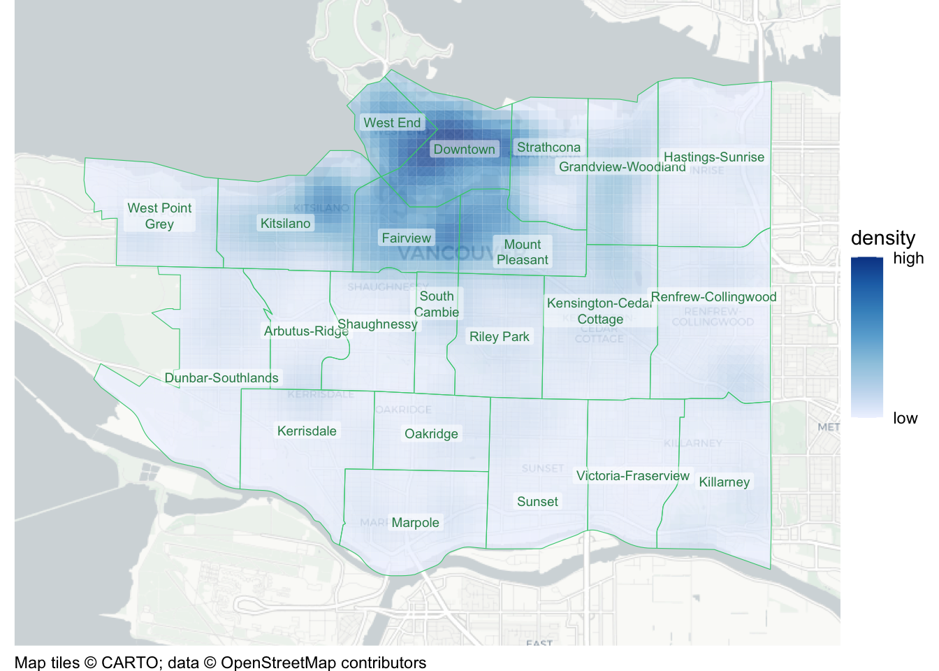
By the end of the chapter, you will have produced this map:
In this chapter, we will learn how to:
- estimate a density layer using
hotspot_kde(); - choose an appropriate projected coordinate reference system;
- adjust grid-cell size and bandwidth;
- choose an appropriate sequential colour scale;
- clip a density layer to the area covered by the data using
hotspot_clip(); and - add neighbourhood boundaries and labels.
The process we will use to produce the map has four main stages:
Load
download data from the internet and load it into an R session
Wrangle
data into the format we need
Model
data using kernel density estimation
Visualise
density on a map
In Chapter 5 you created chapter_05.R, which contains the code needed to download, load and prepare the Vancouver bike-theft data. We will make a copy of that script and add the code needed for this chapter:
- In Positron’s Explorer panel, expand the
Rfolder if necessary. - Right-click
chapter_05.Rand choose Copy. - Right-click the
Rfolder and choose Paste. - Right-click the copied file, choose Rename, type
chapter_06.Rand press .
Take care to copy the file rather than renaming the original. Keep chapter_06.R in the R folder throughout this chapter.
Update the comment at the top of chapter_06.R to explain that this script produces a density map of bicycle thefts in Vancouver in 2020.
Open chapter_06.R and remove the final line, which uses hotspot_map() to produce the previous dot map of bike thefts. During this chapter we will add new code to the chapter_06.R file to produce a map of crime density.
After you have removed the final line from the code, run the rest of the code in the file by selecting all the code and pressing on your keyboard.
6.2 Mapping crime density
When we speak about the density of crime, we mean the relative concentration of points in each part of the area we are studying, i.e. how many points (in this case, representing bike thefts) are there in each part of the map relative to all the other areas of the map.
To estimate the density of points in different areas of the map, R uses a technique called kernel density estimation (KDE). To do this, R must:
- divide the map into a grid of cells, each the same size,
- count the number of points in each cell,
- for each cell, count the number of points in nearby cells, but give less weight to (i.e. systematically undercount) those cells that are further away,
- for each cell, total up the count of points in that cell and the (weighted) count of points in nearby cells – this is the estimate of the density of points in that cell.


There are several ways we can make density maps in R. In this course we will use the sfhotspot package because it makes reasonable default decisions about how density maps should look, while still giving us control over their appearance if we want it. sfhotspot also has other useful functions that we will use in Chapter 13.
To create a density map using sfhotspot, we first use the hotspot_kde() function to convert a dataset of offence locations to an estimate of the density of offences for each cell in a grid. hotspot_kde() automatically chooses how big the cells in the grid should be (but we can set this ourselves if we want to).
Add this code to the script file for this chapter and then run that line of code:
TipWhy did we specify
quiet = TRUE?
The quiet = TRUE argument to the hotspot_*() family of functions (including hotspot_kde()) stops the function from producing progress messages as we go along. If you experience any problems using the hotspot_kde() function, the best place to start in working out what has happened is to run the code again with the quiet = TRUE argument removed.
As usual, we can use the head() function to check what the resulting object looks like:
Simple feature collection with 6 features and 2 fields
Geometry type: POLYGON
Dimension: XY
Bounding box: xmin: 490447.2 ymin: 5450107 xmax: 491647.2 ymax: 5450307
Projected CRS: WGS 84 / UTM zone 10N
# A tibble: 6 × 3
n kde geometry
<dbl> <dbl> <POLYGON [m]>
1 0 2.76 ((490447.2 5450107, 490447.2 5450307, 490647.2 5450307, 490647.2 …
2 0 2.24 ((490647.2 5450107, 490647.2 5450307, 490847.2 5450307, 490847.2 …
3 0 2.04 ((490847.2 5450107, 490847.2 5450307, 491047.2 5450307, 491047.2 …
4 0 2.63 ((491047.2 5450107, 491047.2 5450307, 491247.2 5450307, 491247.2 …
5 0 3.24 ((491247.2 5450107, 491247.2 5450307, 491447.2 5450307, 491447.2 …
6 0 3.13 ((491447.2 5450107, 491447.2 5450307, 491647.2 5450307, 491647.2 …The bike_theft_density object created by hotspot_kde() contains three columns: n contains the count of bike thefts in each cell, kde contains the estimate of the density of thefts in each cell, and geometry contains the outline of each grid cell.
hotspot_kde() produces an object that hotspot_map() recognises and can use to automatically produce a density map. We will need to customise this map somewhat to make it useful, but for now we can use hotspot_map() to produce a basic density map of bike thefts in Vancouver:

In this map, instead of seeing each crime as a separate point, we see the density of crime as the filled colour of cells in a grid. By comparing this density map to the point map we produced before, we can see that the density map makes the areas with the highest frequency of thefts slightly easier to identify (although we will improve it much further below).
You can also see that our map now has a legend, showing that higher densities of bike thefts are shown on the map in dark blue and lower densities are shown in light blue.
QuizDensity mapping
What is a key advantage of using KDE over dot maps for crime data?
Which R function is used to create a density layer from point data?
6.2.1 Choosing a projected coordinate reference system
As we learned in Chapter 5, spatial data can use different coordinate reference systems (CRSs). Data that use a geographic CRS usually store locations as longitude and latitude measured in decimal degrees. Decimal degrees are difficult to use for parameters that represent distances: for example, a cell size of 0.002 degrees is much less intuitive than a cell size of 200 metres. A projected CRS designed for the part of the world we are analysing will often use familiar units such as metres, making distances easier to specify and interpret.
The hotspot_kde() function automatically transforms data to a suitable projected CRS in the background if necessary, so you do not need to transform longitude and latitude data before using that function. Other spatial functions do not always do this automatically, however, and we will sometimes want to choose a projected CRS ourselves.
The suggest_crs() function from the crsuggest package can identify projected CRSs designed for the area covered by a spatial dataset. Run this code in the R Console to see suitable CRSs for the Vancouver bike-theft data:
# A tibble: 10 × 6
crs_code crs_name crs_type crs_gcs crs_units crs_proj4
<chr> <chr> <chr> <dbl> <chr> <chr>
1 3153 NAD83(CSRS) / BC Albers project… 4617 m +proj=ae…
2 3005 NAD83 / BC Albers project… 4269 m +proj=ae…
3 26710 NAD27 / UTM zone 10N project… 4267 m +proj=ut…
4 3157 NAD83(CSRS) / UTM zone 10N project… 4617 m +proj=ut…
5 26910 NAD83 / UTM zone 10N project… 4269 m +proj=ut…
6 32610 WGS 84 / UTM zone 10N project… 4326 m +proj=ut…
7 32410 WGS 72BE / UTM zone 10N project… 4324 m +proj=ut…
8 32210 WGS 72 / UTM zone 10N project… 4322 m +proj=ut…
9 3979 NAD83(CSRS) / Canada Atlas Lam… project… 4617 m +proj=lc…
10 3978 NAD83 / Canada Atlas Lambert project… 4269 m +proj=lc…suggest_crs() returns a table of possible coordinate systems. The crs_code column gives the EPSG code that we can use with st_transform(), while crs_name describes the coordinate system and crs_units shows the units it uses. In general, we can use the CRS in the first row as long as its units are metres. If it uses unfamiliar units, we can choose the first suggested CRS that uses metres instead.
The Vancouver data already use UTM zone 10N (EPSG:32610), an appropriate projected CRS whose coordinates are measured in metres, so we do not need to transform them. When a transformation is needed, we can pass the chosen code to st_transform(). For example, bike_thefts |> st_transform("EPSG:3153") would transform the Vancouver data to the first CRS suggested in the table.
6.2.2 Fine-tuning cell size and bandwidth
We can control the appearance of KDE maps in several ways. For example, we can vary the number of cells in the grid and the definition of what cells the kernel density estimation process should consider to be ‘nearby’ for the purposes of calculating weighted counts. Cells are considered to be ‘nearby’ to a particular cell if they are closer to that cell than a distance known as the KDE bandwidth.
By default, hotspot_kde() chooses the cell size and the bandwidth automatically. The panels in Map 6.3 show how changing these defaults changes the appearance of our map (with the legend and axes removed to make the small maps clearer).

NoteMap description: cell size and bandwidth comparison
All fifteen panels use the same Vancouver bicycle-theft locations. Columns use one, two and four times the default cell size, from left to right. Rows use four, two, one, one half and one quarter of the default bandwidth, from top to bottom.
Across a row, larger grid cells turn smooth-looking shapes into visible blocks. Down a column, reducing bandwidth separates a broad northern concentration into several smaller patches; at the smallest bandwidth, many isolated pale spots appear. Changing these settings changes how the same events are represented, rather than changing where the thefts occurred.
By looking at the maps on the right-hand side, you can see that reducing the number of grid cells leads to a map that looks blocky and lacks information. Looking at the maps towards the top of Map 6.3, you can see that increasing the bandwidth relative to the default makes the density surface smoother. The smoother the surface, the less detail we can see about where crime is most concentrated, until on the top row we can see almost no information at all. On the other hand, if we reduce the bandwidth too much (the bottom row of maps), each estimate is influenced by only the closest events, so the surface becomes fragmented and it is more difficult to identify broader patterns.
In many cases, you will not need to change the cell size used in calculating the density of points on a map, but if you do then you can do this using the cell_size argument to hotspot_kde(). A cell size of about 200 metres is often a good choice for maps showing a whole city, such as our map of Vancouver. However, for larger cities you might want to use a larger cell size and for maps of neighbourhoods you will usually want to use a smaller cell size.
Although you can set the bandwidth manually using the bandwidth argument to hotspot_kde(), you will almost never want to do this. Instead, you can vary the bandwidth relative to the automatically chosen default bandwidth by using the bandwidth_adjust argument. For example, if you wanted to see more detail in your map by using a smaller bandwidth, you could use bandwidth_adjust = 0.75 or bandwidth_adjust = 3/4 to set the bandwidth to be three-quarters of the default bandwidth.
ImportantStart with
bandwidth_adjust = 0.5
I recommend using a slightly smaller bandwidth than the default, so that your maps show a bit more detail. Try setting bandwidth_adjust = 0.5 whenever you produce a density layer using hotspot_kde(), but remember to look at the map to see if you are happy with the result. If you are not happy, try varying the value of bandwidth_adjust. It is possible to set a value greater than 1, but it is very unlikely that this would produce the most-informative possible map.
QuizMaking density maps
What R package do we use to make density maps using the hotspot_kde() function?
What is the bandwidth_adjust argument of the function hotspot_kde() used for?
In what circumstances is it appropriate to use a diverging colour scale, e.g. one that goes from blue to white to red?
Why is it a bad idea to use a diverging colour scheme for crime density maps?
6.3 Clipping map layers
There is one limitation of the KDE layer on our map that we need to deal with. The area covered by the KDE layer is determined by the area covered by the point data that we provided to hotspot_kde(). More specifically, hotspot_kde() will calculate density values for every cell in the convex hull around the point data, i.e. for the smallest polygon that contains all the points in the data.
This can be a problem in some circumstances, because we do not necessarily have crime data for all the areas within the convex hull of the data, even though KDE values will be calculated for those areas. This could be misleading, since it will look like such areas have low crime density, when in fact we do not know what the density of crime in such areas is because they are outside the area for which we have crime data..
Fortunately, we can easily deal with this problem by clipping the KDE layer to the boundary of the area for which we have crime data. This means we will only show densities for cells for which we actually have data.
A. We only have data on bike thefts from the City of Vancouver, so all the bike thefts in the data necessarily occurred within the city. We do not know what the density of recorded bike theft outside the city is.

B. The KDE function only knows the theft locations, not the area in which thefts could have occurred. So the convex hull created by the KDE layer will not necessarily match the area of the data.

C. In this case, that means some areas (shaded) will be included in the KDE layer even though they are outside the area covered by the data, which could be misleading.

D. To avoid suggesting we know the density of crimes in areas for which we do not have data, we should clip the KDE layer to the boundary of the area for which we have data.

You might see from these maps that there is another problem: some areas within the City of Vancouver are not covered by the KDE layer. We’ll deal with that problem in Chapter 7. But for now, to clip the KDE layer to the boundary of the area for which we have data, we need a new dataset that contains the boundary of the City of Vancouver. Fortunately this dataset is available online in a spatial format known as a GeoJSON file. GeoJSON is a spatial file format, so we can load it in R using the read_sf() function from the sf package.
As we did for the theft data in Section 5.4.1, we will first download the boundary data into data/raw, then read the local copy. This records where the data came from while keeping the analysis available if the website is temporarily unavailable later. Add this code immediately after the existing code that downloads the theft data but above the code that loads and wrangles the data.
Add Code 6.6 after the pipeline that loads and wrangles the bike-theft data and before the code that creates bike_theft_density:
You might have noticed that as well as loading the boundary data with read_sf(), we have transformed the data to use the same coordinate system (EPSG:32610) as is used for the bike_thefts object. This is because we can only clip datasets that use the same coordinate system.
Before we clip the density layer to the city boundary, check that your file chapter_06.R looks like this:
chapter_06.R
# This script produces a density map of bicycle thefts in Vancouver in 2020.
# Load packages
pacman::p_load(here, httr2, sf, sfhotspot, tidyverse)
# Download the raw data to a local file
request(
"https://mpjashby.github.io/crimemappingdata/vancouver_thefts.csv.gz"
) |>
req_perform(path = here("data", "raw", "vancouver_thefts.csv.gz"))
# Download Vancouver neighbourhood boundaries
request(
"https://mpjashby.github.io/crimemappingdata/vancouver_neighbourhoods.geojson"
) |>
req_perform(
path = here("data", "raw", "vancouver_neighbourhoods.geojson")
)
# Load and wrangle bike theft data
thefts <- here("data", "raw", "vancouver_thefts.csv.gz") |>
read_csv() |>
janitor::clean_names() |>
st_as_sf(coords = c("x", "y"), crs = "EPSG:32610")
bike_thefts <- filter(thefts, type == "Theft of Bicycle")
# Load Vancouver neighbourhood boundaries
vancouver_nbhds <- here("data", "raw", "vancouver_neighbourhoods.geojson") |>
read_sf() |>
st_transform("EPSG:32610")
# Estimate density of bike thefts
bike_theft_density <- hotspot_kde(
  bike_thefts,
  bandwidth_adjust = 0.5,
  quiet = TRUE
)We can clip the KDE layer produced by hotspot_kde() to the boundary of the City of Vancouver using the hotspot_clip() function from sfhotspot. hotspot_clip() keeps the parts of the KDE cells that fall inside the area covered by the boundary layer and removes the rest.
We will now add the code needed to clip the KDE layer to the city boundary to chapter_06.R. Since we do not need the unclipped version of the KDE layer in the final map, we can combine hotspot_kde() and hotspot_clip() in one pipeline. Replace the code that creates bike_theft_density with this code:
- 1
-
take the
bike_theftsobject, and then - 2
- use it to estimate the density of thefts and then
- 3
-
clip the resulting density object to the boundary stored in the
vancouver_nbhdsobject.
Removed 397 rows (12.0% of original rows) from `data`If you aren’t comfortable yet with how the pipe operator works, you might want to refer back to Section 4.6.
ImportantBoth layers must use the same coordinate system
hotspot_clip() requires both spatial layers to use the same coordinate system. If the layers use different coordinate systems, transform one of them with st_transform() so that it uses the same system as the other layer.
If you do not know which coordinate systems the layers use, you can use the st_crs() function to extract the coordinate system from one layer and pass that value as the second argument to st_transform(). For example:
QuizClipping map layers
What is the purpose of the hotspot_clip() function?
Why is it important to clip a KDE layer to a relevant boundary in crime mapping?
6.4 Specifying a grid for kernel density estimation
By default, hotspot_kde() calculates density estimates (KDE values) for every grid cell within the area (the convex hull) covered by the crime data. This is fine when at least a few crimes have occurred in all the parts of the area for which we have data. But if crime is heavily concentrated in a few places and there are large areas with no crimes, the density layer will not cover the whole area for which we have data. You can see this in Map 6.7 – some areas on the outskirts of the city are not covered by the convex hull of the bike_thefts data. When this is the case, it is important to extend the density layer manually to make it clear that the apparent low density of crime in some places is due to a genuine lack of recorded crime there, rather than because we do not have data for those places.
We can do this by providing hotspot_kde() with a grid of cells for which KDE values should be calculated, rather than letting hotspot_kde() create the grid automatically. The easiest way to do this is to use the hotspot_grid() function to create a grid that covers all the areas within a set boundary, such as a city boundary.
In the chapter_06.R file, replace the code that creates bike_theft_density_clip with this code:
Removed 160 rows (4.9% of original rows) from `data`You’ll see below that the bike_theft_density_clip object now contains a grid that covers the whole of Vancouver and no areas outside Vancouver. This stops the density layer from possibly conveying misleading information.
6.5 Isobands
KDE maps are extremely useful because they allow us to visualise overall patterns of crime much more easily than if we simply plot crimes on a dot map. But the density layers produced by hotspot_kde() can sometimes be hard to interpret on a map. One alternative way to visualise density is to convert the density surface to isobands. Isobands are polygons that represent areas of equal crime density. You might have seen them on weather maps, where they are sometimes used to visualise areas that are expected to have the same temperature:
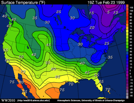
We can convert the output produced by hotspot_kde() to isobands using the hotspot_isoband() function from sfhotspot. This function takes a KDE layer and converts it to a set of polygons that represent areas of equal density. We can then plot these polygons on a map instead of the KDE layer. For example, we can just add hotspot_isoband() to the end of the code pipeline we used to create the clipped KDE layer, and then plot the result.

- It is important to add
hotspot_isoband()to the pipeline beforehotspot_clip(), since otherwisehotspot_isoband()is likely to produce an error.
One potential drawback of using isobands is that they create the risk of the environmental fallacy: all the locations on the map within a particular isoband look on the map like they have exactly the same density of crime, when fact there will be some variation within each band because each band represents a range of values. How big this problem is depends on how wide the range of values is in each isoband. We can control this by specifying how many different bands the range of KDE values should be split into. By default, hotspot_isoband() splits the range of values into 5 bands, but we can change this using the breaks argument. For example, if we wanted to split the range of values into 10 bands, we could use hotspot_isoband(breaks = 10).
Whether to visualise KDE values or generalise them into isobands first is up to you. Both are valid ways to visualise the density of a particular type of crime. You might want to experiment with both approaches to see which one better communicates the information you want to show on your map. In this book, we will generally visualise KDE layers rather than isobands to keep the code examples short, but you should feel free to experiment with both approaches.
6.6 Adding more layers
One way make our density map more useful would be to add the boundaries of different neighbourhoods in Vancouver so that users could see where the different areas of high crime are located. This would also have the benefit of showing the outline of the city (the area for which we have data).

To add more layers to our map we need to learn about another R package: ggplot2. In the background, hotspot_map() uses functions from the ggplot2 package to put together the different parts of a map. That means we can use other functions from the ggplot2 package to build upon the map that hotspot_map() produces. Over the next few chapters we will learn about several families of functions that ggplot2 provides so that we can fine-tune the appearance of a map.
TipWhy do we combine
hotspot_map() with functions from ggplot2?
The ggplot2 package is the most popular package for making visualisations of all types in R. ggplot2 gives us lots of control over how visualisations appear, but that high level of control can sometimes mean the code needed to produce a visualisation is long and complicated.
Since there are elements that are common to almost all maps, behind the scenes the hotspot_map() function uses ggplot2 (and another package called ggspatial) to produce a map quickly and easily. This means that we can use hotspot_map() to make maps quickly and easily, and then use functions from ggplot2 to fine-tune the appearance of those maps.
In the background, hotspot_map() sets up the basic combination of ggplot2 functions that are needed to produce a particular type of map. The combination of functions that is required depends on the type of map that we are making. For example, a density map requires a different combination of functions than a dot map. The hotspot_map() function takes care of this for us, so that we can focus on the parts of the map that we want to change. For example, when we run the code:
in the background hotspot_map() combines these functions from ggplot2:
ggplot() +
ggspatial::annotation_map_tile(zoomin = 0, progress = "none") +
geom_sf(aes(fill = kde), data = bike_theft_density, colour = NA) +
scale_fill_distiller(
type = "seq",
palette = "Blues",
direction = 1,
breaks = range(pull(bike_theft_density, kde)),
labels = c("low", "high"),
na.value = "transparent"
) +
labs(
caption = "© OpenStreetMap contributors",
fill = "density"
) +
theme_void()As you can see, the code hotspot_map(bike_theft_density) conceals quite a lot of complexity, so we can focus on other jobs. We will learn more about how ggplot2 works in Chapter 14, but for now we will just learn enough to be able to add more layers to our maps.
We can add functions from the ggplot2 package to hotspot_map() by using the + operator. This works in a very similar way to the pipe operator (|>) that we’ve already learned about – it’s just a quirk of ggplot2 that it uses + instead of |>. By convention, each function that we add to hotspot_map() to change the appearance of our map goes on a new line (this makes the code easier to read) and all but the first line is indented by two spaces. Positron does this indenting automatically if the previous line ends with a + symbol, since Positron then understands that there is more code to come on the next line.
The first family of functions we will learn about is the geom_*() family. The geom_ functions are used to add data – such as points, lines or polygons – to a map. Since map data is usually stored in an SF object, we use the geom_sf() function to add a spatial dataset to a map.
Add this map-plotting code to the end of chapter_06.R:

It would also be useful to add labels showing the names of the different neighbourhoods. The challenge with adding labels to maps is to make sure those labels are legible while not obscuring the data layer, so we’ll have to do this carefully.
We can add labels to a map using the geom_sf_label() function from ggplot2. But to do that, we need to learn about another aspect of the ggplot2 ecosystem: specifying aspects of the appearance of a map based on columns in a dataset. You might remember that the vancouver_nbhds dataset contains a column called name that contains the names of the different neighbourhoods:
Simple feature collection with 6 features and 3 fields
Geometry type: POLYGON
Dimension: XY
Bounding box: xmin: 483843.3 ymin: 5449706 xmax: 498305.7 ymax: 5458628
Projected CRS: WGS 84 / UTM zone 10N
# A tibble: 6 × 4
name mapid geo_point_2d geometry
<chr> <chr> <list> <POLYGON [m]>
1 Dunbar-Southlands DS <dbl [2]> ((487615.5 5455027, 487606.1 5453561, …
2 Kerrisdale KERR <dbl [2]> ((486957.9 5451434, 487209 5451413, 48…
3 Killarney KIL <dbl [2]> ((498283.7 5449706, 497087.9 5450130, …
4 Kitsilano KITS <dbl [2]> ((489985.4 5458071, 489543.7 5457840, …
5 South Cambie SC <dbl [2]> ((491556.7 5453913, 491543.2 5453419, …
6 Victoria-Fraserview VF <dbl [2]> ((495860.2 5450158, 495741.3 5450160, …We can use the values in the name column to specify the text of the labels we want to add to the map. To do this, we need to use the aes() function from ggplot2, which is used to specify aesthetics. We mentioned aesthetics briefly in Section 5.6.1, but in that section we only covered specifying static aesthetics that applied equally to all the elements in a layer. For example, we used colour = "red" to set the colour of all the points in a layer. In this case, we need to control the appearance of the labels based on the values in a column in the dataset, so we need to use dynamic aesthetics. We can do that by using the aes() function to specify which column in the dataset we want to use for each aesthetic.
The aes() function takes as its arguments pairs of values (combined with an = symbol) where the first value is an aesthetic and the second value is the name of a column in the data. For example, to use the colour of points on a map to represent different types of crime that were stored in a column in the data called type, we could use aes(colour = type). This is called mapping a column to an aesthetic.
ImportantWhen to specify values inside or outside
aes()
When should you specify the values of aesthetics inside aes() and when should you do it outside aes()?
- If you want an aesthetic to have a constant value for all the points, lines or other shapes in a layer, control the aesthetic outside
aes(). For example, you could usehotspot_map(bike_thefts, colour = "mediumblue")to make all the shapes in that layer blue. - If you want to vary the appearance of shapes according to values in the data, you should control the aesthetic inside
aes(). For example, you could usegeom_sf(aes(colour = month), data = bike_thefts)to vary the colour of shapes in a layer according to values of themonthcolumn in a dataset.
If you specify a constant value for an aesthetic (e.g. colour = "mediumblue") this will override any mapping for that aesthetic provided by the aes() function (e.g. aes(colour = month)). If you have used aes() to specify that an aesthetic should be controlled based on a column in the data but find that the aesthetic is not changing based on the data, check you have not also specified a constant value for that aesthetic.
aes() should normally be the first argument in a geom_*() function. If you want to specify the arguments in a different order then you must give the name of each argument, which means that for the aes() function you must specify mapping = aes(...) when aes() is not the first argument to whatever geom_*() function you are using.

Since we want the text of the labels to be the names of the neighbourhoods, we can use aes(label = name) to map the name column in the vancouver_nbhds dataset to the label aesthetic. This will make the text of each label equal to the value in the name column for that neighbourhood. However, some of the neighbourhood names are quite long, and so we will need to wrap the text of those labels onto multiple lines so that they do not overlap adjacent neighbourhoods. We can do this using the str_wrap() function from the stringr package, which is part of the tidyverse. str_wrap() takes a string and wraps it onto multiple lines if it is longer than a specified width. We can use str_wrap() inside the aes() function to wrap the text of the labels based on the values in the name column. For example, we could use aes(label = str_wrap(name, width = 10)) to wrap any neighbourhood names that are longer than 10 characters onto multiple lines.
Replace the existing hotspot_map() stack in the chapter_06.R file with this stack and then run that code. You will see that as well as specifying the label aesthetic using aes(), we have also specified several other aesthetics outside of aes() to make sure the labels are less visually prominent than the density layer (because the most-important element on a map is always the data layer).
chapter_06.R
# Plot density map
hotspot_map(bike_theft_density_clip, basemap_type = "cartolight") +
# Add neighbourhood boundaries
geom_sf(data = vancouver_nbhds, colour = "seagreen3", fill = NA) +
# Add neighbourhood names
geom_sf_label(
aes(label = str_wrap(name, 10)),
data = vancouver_nbhds,
alpha = 0.5,
colour = "seagreen",
fill = "white",
lineheight = 1,
size = 2.5,
linewidth = NA
)
alpha = 0.5makes the label background semi-transparent so that we can see the density layer underneath it,colour = "seagreen"slightly reduces the prominence of the label text to avoid distracting attention from the density layer,fill = "white"makes the label background white so that it is legible against the base map and density layer, remembering that since we have setalpha = 0.5the background will be semi-transparent,lineheight = 1reduces the gap between lines in each label,size = 2.5slightly reduces the size of the label text,linewidth = NAremoves the default border around the label background.
From this map, we can see that recorded bike theft in Vancouver is heavily concentrated in a handful of neighbourhoods, particularly Downtown and the West End. This map makes the broad pattern easier to see than the point map in Chapter 5, and shows how the concentrations relate to different areas of the city.
QuizAdding map layers
Which function adds labels at the locations of spatial features?
What does str_wrap(name, width = 10) do to the neighbourhood labels?
TipTips for producing effective density maps
- Produce separate density layers for different types of crime. Combining offences can hide distinct spatial patterns and will make the result more strongly influenced by whichever offence is most numerous.
- Be cautious about mapping offences that are mainly found through police activity, such as drug or weapon possession. Their recorded locations can reflect where officers patrol as much as where offences occur.
- Remember that a KDE map shows concentrations of recorded events, not the risk that an event will happen to a person or place. Interpreting risk also requires information about the relevant population or opportunities and will be covered in Chapter 13.
6.7 In summary
In this chapter we explored how KDE can make broad patterns in a large point dataset easier to see. A density map can help practitioners explore where recorded events are concentrated, but it should not determine decisions by itself: the result can also reflect reporting, opportunities, population and police activity.
We have practised how to:
- estimate density with
hotspot_kde(); - choose an appropriate projected coordinate reference system;
- adjust grid-cell size and bandwidth;
- map density using an appropriate sequential colour scale;
- clip a density layer with
hotspot_clip(); and - add boundaries and labels in the correct layer order.
Your complete script should now look like this:
chapter_06.R
# This script produces a density map of bicycle thefts in Vancouver in 2020.
# Load packages
pacman::p_load(here, httr2, sf, sfhotspot, tidyverse)
# Download the raw data to a local file
request(
"https://mpjashby.github.io/crimemappingdata/vancouver_thefts.csv.gz"
) |>
req_perform(path = here("data", "raw", "vancouver_thefts.csv.gz"))
# Download Vancouver neighbourhood boundaries
request(
  "https://mpjashby.github.io/crimemappingdata/vancouver_neighbourhoods.geojson"
) |>
  req_perform(
    path = here("data", "raw", "vancouver_neighbourhoods.geojson")
  )
# Load and wrangle bike theft data
thefts <- here("data", "raw", "vancouver_thefts.csv.gz") |>
read_csv() |>
janitor::clean_names() |>
st_as_sf(coords = c("x", "y"), crs = "EPSG:32610")
bike_thefts <- filter(thefts, type == "Theft of Bicycle")
# Load Vancouver neighbourhood boundaries
vancouver_nbhds <- here("data", "raw", "vancouver_neighbourhoods.geojson") |>
  read_sf() |>
  st_transform("EPSG:32610")
# Estimate density of bike thefts and clip the result
bike_theft_density_clip <- bike_thefts |>
  hotspot_kde(
    grid = hotspot_grid(vancouver_nbhds, quiet = TRUE),
    bandwidth_adjust = 0.5,
    quiet = TRUE
  ) |>
  hotspot_clip(vancouver_nbhds)
# Plot density map
hotspot_map(bike_theft_density_clip, basemap_type = "cartolight") +
  # Add neighbourhood boundaries
geom_sf(data = vancouver_nbhds, colour = "seagreen3", fill = NA) +
# Add neighbourhood names
geom_sf_label(
aes(label = str_wrap(name, 10)),
data = vancouver_nbhds,
alpha = 0.5,
colour = "seagreen",
fill = "white",
lineheight = 1,
size = 2.5,
linewidth = NA
)The script is in a logical order: it loads packages, downloads and prepares data, estimates and clips density, then produces the map. It includes only the permanent code needed to repeat the analysis, and comments identify each task.
Save chapter_06.R by pressing .
To check that the analysis is reproducible, restart R using the Restart R (⟳) button in Positron’s Console panel, then run the script from beginning to end.
Keep the script in the R folder and the downloaded source files in data/raw.
You can learn more about:
- the arguments and output of
hotspot_kde()in the sfhotspot documentation; - choosing and using colour schemes in Working with colours in R; and
- exploring palettes using the Color Palette Finder.
QuizRevision questions
Answer these questions to check you have understood the main points covered in this chapter. Write between 50 and 100 words to answer each question.
- What is kernel density estimation (KDE), and why is it useful for mapping crime patterns? Explain the process briefly.
- Why can density maps be more effective than point maps for visualising patterns in large crime datasets?
- What are the main factors to consider when adjusting grid-cell size and bandwidth? How can these adjustments affect a KDE map?
- Why is it important to clip a density layer to the boundary of the area covered by the data, and which function should you use?
- How does the choice of colour scale affect the interpretation of a density map? When should you use sequential, diverging and qualitative colour schemes?
Isotherm map courtesy of the University of Illinois WW2010 Project.