
7 Giving a map context

In Chapter 5 and Chapter 6 we’ve learned how to make maps of crime data. In this chapter we’ll learn to make those maps more useful by adding context using titles, legends and other supporting elements. In particular we’ll focus on the important of visual hierarchy in guiding a reader’s attention to the most important parts of a map. We’ll also learn how to save a finished map as a file so that it can be shared with others.
TipBefore you start
- Open Positron or – if you already have Positron open – start a new R session by clicking the Restart R (⟳) button in the Console panel. This makes sure no code you ran previously will interfere with the work you do in this chapter.
- Make sure you are working in the crime mapping project workspace you created in Section 1.5. In the top-right corner of the Positron window, you should see a folder icon and the words
crime_mapping. If not, click the File menu, then Open Folder … and choose thecrime_mappingfolder.
7.1 Introduction
In this chapter we will create this map of shootings in the Bronx (one of the five boroughs of New York City) in 2019.
You can see that this map includes contextual elements such as a title, a legend and a scale bar. In this chapter we will learn how to add each of these elements to a map, and (just as importantly) when you shouldn’t use them.
In this chapter, we will learn how to:
- make design decisions based on a map’s purpose and audience;
- use visual hierarchy to guide a reader’s attention;
- add and format titles, subtitles and captions;
- make legends easier to understand;
- add scale bars and north arrows when they are useful; and
- save a finished map as a file.
The process we will use has five main stages:
Load
download data from the internet and load it into an R session
Wrangle
data into the format we need
Model
data using kernel density estimation
Visualise
density on a map, including supporting elements
Save
the completed map
7.2 Map choices
Among the most important decisions you make when you are creating a map is what information to include and what to leave out. Watch this video to learn more about why this is important and how you can make those decisions.
QuizMap choices
Which statement best summarizes the key points of the video?
What is one potential benefit of leaving out information on a map?
What is one way that maps can unintentionally mislead their audience?
The most important thing to remember when designing a map is the purpose for which it will be used. Research on how people use maps has repeatedly shown that the task a reader wants to complete strongly influences how they process the information on a map. You can read more about this in Cartography, visual perception and cognitive psychology by Amy Griffin.
As explained in the video, when you create a crime map you should ask yourself:
- What will readers be using this map for?
- What information do readers need?
- What do readers already know?
- In what context are people going to use this map?
- How could this map lead the audience to a wrong conclusion?
Maps are powerful communication tools. The choices made by a map maker can deliberately or inadvertently mislead readers. Watch this video to learn more about how maps can be misleading.
QuizDo maps lie?
According to the video, why should we critically evaluate maps?
What is the main difference between Jim’s and Anna’s maps of London house prices?
What three questions should you ask when evaluating a map?
Whenever you make a map, think about your own biases – are your own views on a topic likely to influence the results of your analysis? One way to test your own assumptions about a topic is to test them against other potential assumptions using an approach to crime analysis called hypothesis testing. To find out more about this approach, read Improving the explanatory content of analysis products using hypothesis testing by Spencer Chainey.
7.3 Visual hierarchy
Maps are among the most complex types of data visualisation. Even if we have chosen wisely what to include and what to leave out, there is likely to be lots of information on our map. For all but the simplest maps, there is a risk that readers – especially those in a hurry – might be overwhelmed or misled by competing pieces of information, such as different data layers.
To help readers understand what parts of a map they should focus most of their attention on and which are of less importance, we can establish a visual hierarchy. Watch this video to learn more about visual hierarchies in mapping.
QuizVisual hierarchy
What is the main goal of establishing a visual hierarchy in maps?
How does isolation affect the prominence of an element on a map?
How does text size contribute to visual hierarchy?
We have used some of the principles of visual hierarchy in the maps we have already made. For example, in the density map of bike thefts in Vancouver, we used strong colours to represent the data and shades of grey for the base map. This helped readers intuitively understand that they should focus most attention on the data.
7.4 Supporting elements
We can often make our maps much more useful by adding supporting elements that explain the map content, give context or provide extra information. Supporting elements include titles, captions, legends, base maps, scale bars and north arrows.
We will not need to include every supporting element on every map. The hierarchy will depend on the map’s purpose, but the data, title and legend will usually be among the most-prominent elements. Other elements should be designed so that they provide useful context without distracting from the main message.
| place in hierarchy | map element | how often needed |
|---|---|---|
| 1st | data layers | always |
| 2nd | title | virtually always |
| 3rd | legend | usually |
| 4th | base map | almost always |
| 5th | author and date | virtually always |
| =6th | scale | sometimes |
| =6th | north arrow | sometimes |
| 7th | grid | rarely |
The table is a useful starting point rather than a rule that applies to every map. Elements that are often needed are not necessarily high in the visual hierarchy. For example, the author’s name is important for readers who need to judge the reliability of a map or get in touch to ask questions, but it should not distract readers from the map’s main message.
QuizSupporting elements
What is the main purpose of supporting elements on a map?
How should you use the hierarchy shown in the table?
7.5 Creating and storing a map
Since we will be adding various elements to a map in this chapter, we will first create a map and save it as an R object. Any map produced using the hotspot_map() function can be saved as an object using the assignment operator <-. Just as for the result of any other R function, if we save it to an object the result will not be printed to the screen, but we can easily see the plot by simply typing the object name in the R console.
Create a new R script for the permanent code used in this chapter:
- Click the File menu in Positron, then click New File ….
- Type
chapter_07.Rin the box marked Select File Type or Enter File Name…, then press ReturnReturn. - Save the file in the
Rfolder inside yourcrime_mappingworkspace.
The script first downloads the original files into data/raw, then loads and prepares the local copies. Keeping the original files in data/raw means that you can repeat the analysis without depending on the websites remaining available. We will transform both spatial datasets to EPSG:6538, a projected CRS designed for New York whose coordinates are measured in metres. See Section 6.2.1 for how to choose a suitable projected CRS for a particular dataset. Paste this code into chapter_07.R and run it by pressing to select all the code, then .
chapter_07.R
# This script adds contextual elements to a density map of shootings in the
# Bronx in 2019, then saves the finished map as a PDF.

# Load packages
pacman::p_load(ggspatial, here, httr2, sf, sfhotspot, tidyverse)

# Download the raw data
request(
  "https://mpjashby.github.io/crimemappingdata/bronx_shootings.csv"
) |>
  req_perform(path = here("data", "raw", "bronx_shootings.csv"))

request(
  "https://mpjashby.github.io/crimemappingdata/nyc_precincts.gpkg"
) |>
  req_perform(path = here("data", "raw", "nyc_precincts.gpkg"))

# Load shootings data and transform it to use an appropriate coordinate system
shootings <- here("data", "raw", "bronx_shootings.csv") |>
  read_csv(show_col_types = FALSE) |>
  st_as_sf(coords = c("longitude", "latitude"), crs = "EPSG:4326") |>
  st_transform("EPSG:6538")

# Load NYC police precincts data
precincts <- here("data", "raw", "nyc_precincts.gpkg") |>
  read_sf() |>
  janitor::clean_names() |>
  # Filter just those precincts that are in the Bronx (40th to 52nd)
  filter(precinct %in% 40:52) |>
  st_transform("EPSG:6538")

# Estimate density of shootings and clip the result to the Bronx precincts
shootings_kde <- shootings |>
  hotspot_kde(
    grid = hotspot_grid(precincts, cell_size = 200),
    bandwidth_adjust = 0.33,
    quiet = TRUE
  ) |>
  hotspot_clip(precincts, quiet = TRUE)

# Create a basic map object
shootings_map <- hotspot_map(shootings_kde, basemap_type = "cartolight") +
  # Add precinct boundaries
  geom_sf(data = precincts, colour = "grey33", fill = NA) +
  # Add precinct labels
  geom_sf_label(
    aes(label = scales::ordinal(precinct)),
    data = precincts,
    alpha = 0.5,
    colour = "grey33",
    fill = "white",
    size = 2.5,
    linewidth = NA
  )
There’s quite a lot of code here, so if you want to refresh your memory about some of it, you can look back to:
- Section 3.2 about downloading data from the internet and loading data into R from CSV files;
- Section 5.4 about loading data into R from spatial data files;
- Section 2.4 about converting tabular data to SF format and transforming between coordinate systems;
- Section 3.4 about filtering data; and
- Chapter 6 about estimating the density of crime and clipping the result to a specific area.
- Section 6.6 about adding layers to a map using
geom_sf()andgeom_sf_label().
To view the map in Positron, type the name of the map object into the R Console and press as usual.
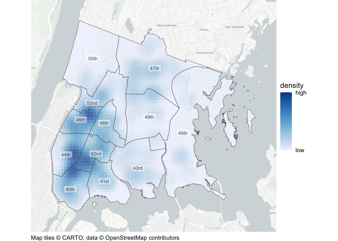
The code used to create this map is very similar to the code we used in Section 6.2 to make a map of bike theft in Vancouver, although there are a few differences.
7.5.1 Formatting numbers using the scales package

The only other difference from the Vancouver map is that we have used the ordinal() function from the scales package to convert the precinct numbers to ordinal numbers (1st, 2nd, 3rd, etc.) for the map labels. This is because police precincts in New York City are usually referred to using ordinal numbers (e.g. “the 1st Precinct” rather than “Precinct 1”) and it will be easier for people to read the map if it uses terms they are familiar with.
ImportantDon’t always use ordinal numbers for labels
We are using ordinal numbers (1st, 2nd, etc.) for the labels because that is how police precinct numbers are usually expressed in New York City. That does not mean that we should always wrap map labels in the ordinal() function. How we present map labels – and every other type of information on a map – depends on what is best for the audience we are making the map for.
There are many other functions in the scales package that format numbers in different ways, including comma() to add thousands separators to numbers and dollar() to format numbers as values in dollars or other currencies. There is a full list of scales functions on the package website.
We now have a basic map of shootings in the Bronx. This map isn’t good enough on its own, but we can use it to learn how to add supporting elements to a map.
7.6 Using colour to show density
In Chapter 6 we learned how to use functions from the sfhotspot package to create a kernel density layer using hotspot_kde() and influence its appearance, for example using hotspot_grid() to control the grid, hotspot_isoband() to calculate isobands and hotspot_clip() to clip the result to a specific area.
The final way we can control the appearance of our density layer is to change the colour scheme used to represent density. To do this, we can use another type of function from the ggplot2 package: scales. Functions in the scale_*() family of functions allow us to control how the mapping between a column in the data and an aesthetic (colour, size, etc.) is represented visually. For example, which colour scheme is used to represent the density of thefts on our map.
By default, hotspot_map() uses a sequential blue colour scheme to represent density, but we can change this to any other colour scheme we like. There are many scale_*() functions, but the scale_fill_distiller() function produces several different colour scales that are specifically designed to be effective on maps.
Colour schemes can be divided into three types:
- sequential colour schemes are useful for showing values that vary from low to high,
- diverging colour schemes are useful for showing values relative to a meaningful central point, and
- qualitative colour schemes are useful for showing separate categories that can appear in any order and still be meaningful.
In crime mapping we’re usually interested in showing how crime varies from low to high, so we need to use a sequential colour palette. There are 18 colour-blind-friendly sequential colour schemes (or palettes) available in scale_fill_distiller(), each with a name:

ImportantChoosing the right type of colour scale
It is important to only use the right type of colour scale in the right circumstances, since using the wrong type of scale could end up misleading people reading your map. For example, a diverging colour scale gives the strong impression that the central point in the scale is meaningful.
In some circumstances this might be useful, for example if you wanted to show areas in which crime had increased in shades of one colour and areas in which crime had decreased in shades of another colour. In that case, a diverging scale would be appropriate because the central point represents something meaningful: no change in crime. If the central point is not meaningful, use a sequential colour scheme instead.
If you want to represent a categorical variable, you should use a categorical colour scale unless the categories have a natural order. For example, if you wanted to show ethnic groups on a map you would use a categorical colour scale, since there is no one order of ethnic groups that is any more meaningful than any other. If you wanted to represent days of the week with colour, then you might want to use a sequential colour scheme since the days of the week have a meaningful order.
By default, scale_fill_distiller() sets the lowest values to have the darkest colour. This does not work well for density maps, since most people tend to interpret sequential colour schemes as if the palest or least-saturated colours represent the lowest values and the darkest or most-saturated colours represent the highest values. If we design maps that meet that expectation, people will generally find them easier to interpret. Fortunately we can do that by setting the argument direction = 1.

You can think of all the functions that we can add to hotspot_map() as being like a stack of pancakes, with each new function being placed on the top of the stack. To change the colour of our map, we just add scale_fill_distiller() to the existing stack. Run this code in the R Console:
Scale for fill is already present.
Adding another scale for fill, which will replace the existing scale.
You’ll note that when we add scale_fill_distiller() to an existing map created by hotspot_map(), R prints a message saying Scale for fill is already present because we are replacing the scale automatically chosen by hotspot_map() with the scale we have specified. As long as you have deliberately chosen to replace the default scale, it’s safe to ignore this message.
You might also notice that the legend on Map 7.4 is different, in that the legend now includes raw KDE values. Most of the people viewing crime maps will not be able to interpret raw KDE values, so it’s usually better to replace these. We can do this using the breaks and labels arguments to scale_fill_distiller(). The breaks argument specifies the values at which we want to place labels on the colour bar, while the labels argument specifies what those labels should say. It’s important to make sure the number of values we supply to the breaks argument is the same as the number of labels we’ve given to the labels argument (otherwise R will produce an error).
In this case, we want to add two labels (“higher” and “lower”), one at either end of the colour bar. We could look at the kde column of the shootings_kde object to find the minimum and maximum values, but that would introduce the risk of accidentally entering the wrong values. Instead, we can use pull() to extract the kde column from the shootings_kde object and then use range() to find its minimum and maximum values. Putting this together gives breaks = range(pull(shootings_kde, "kde")). Read the code from the inside out: take the shootings_kde object, pull out the kde column, then calculate the range of values in that column.
Run this code to see how the legend labels change.
Scale for fill is already present.
Adding another scale for fill, which will replace the existing scale.
Changing the colour scheme of a density map is optional – if you are happy with the default blue colour scheme, you do not need to change it. However, if you do want to change the colour scheme, it is important that you use one of the colour-blind-friendly sequential palettes, such as those available in scale_fill_distiller().
7.7 Base maps
The most-important layer on a map is always the data layer: the layer that shows the information about crime that we want to communicate. But a data layer on its own is often not that useful unless people using the map can show where in the world the data is located. To help with this, it is often useful to add a base map underneath the data layer, so that we can see where the data layer is located in the real world. For example, if we are mapping crime in a city, it is often useful to have a street map of the city underneath the crime data, so that we can see which streets and neighbourhoods are affected by crime.
hotspot_map() automatically adds a base map underneath the data layer we give to it, for example the density layer in Map 7.5. It also automatically sets the data layer to be semi-transparent, so that users can see the base map underneath the data layer. However, we can customise this base map in various ways.
Base maps are composed of tiles, each showing information about a small square on the surface of the Earth. Tiles are available at many different zoom levels, from level 1 that is useful for mapping the whole world in one map, to level 20 that can be used to map a single building. We can see some of the different zoom levels available by looking at these maps, which show the same area around the UCL Jill Dando Institute with base maps at different zoom levels.

Choosing the right zoom level is a matter of balancing the level of detail in the map and the clarity of the image. In Map 7.6, zoom levels less than 12 tend to have pixelated images because they do not contain enough detail, while zoom levels greater than 13 contain too much detail and so the information is hard to read. But if this map covered a smaller or larger area, a different zoom level might be better.
We won’t normally need to worry about the zoom level of the base map, since hotspot_map() automatically chooses a zoom level that is appropriate for the area covered by the data layer. However, if we wanted to add more detail to the base map we could control the zoom level manually with the basemap_zoom argument.
hotspot_map() also gives us access to several different styles of base map. The default style (seen in Map 7.6) is called ‘osm’ because it is the default style used by OpenStreetMap, the organisation that provides the map data. We can specify which style of base map we want using the basemap_type argument to hotspot_map().

One final note about base maps. You might have noticed that when we produce a map with a base map using hotspot_map(), some text is added to the bottom of the map saying something like:
Map tiles ©: CARTO; data © OpenStreetMap contributors
This is called an attribution statement, and it’s usually a legal requirement when using base map tiles downloaded from the internet. Fortunately, hotspot_map() adds this statement automatically when required.
QuizBase maps
What is the purpose of adding a base map to a crime map in R?
Why might you need to be careful in choosing the right base map when creating a crime map?
7.8 Supporting maps with words
7.8.1 Titles
A map title is one of the most important ways to add context to a map. Titles can either be descriptive or declarative. Descriptive titles simply state what data are shown on the map. For example, we might give our map the title “Shootings in the Bronx, 2019”. Declarative titles, on the other hand, state what you think the main conclusion should be that readers remember about the map. For example, we might use the title “Shootings are focused in the South Bronx”.
Declarative titles are usually more useful than descriptive titles because they help the reader to interpret the map. But writing a good declarative title is harder than writing a descriptive title, because it requires you to think about what is the main point that you want to make with the map. To help you come up with a good declarative title, you might want to try several different titles so that you can choose the one that communicates your message most clearly.
We can add a title to our map using the labs() (short for ‘labels’) function from the ggplot2 package. We can use labs() to add labels to various different parts of a map or plot, but for now we will just use the argument title to set the title.
To see how this works, run Code 7.5 in the R Console. Since we have stored the rest of the hotspot_map() stack in the shootings_map object, this code is equivalent to adding labs() to the end of the original stack.
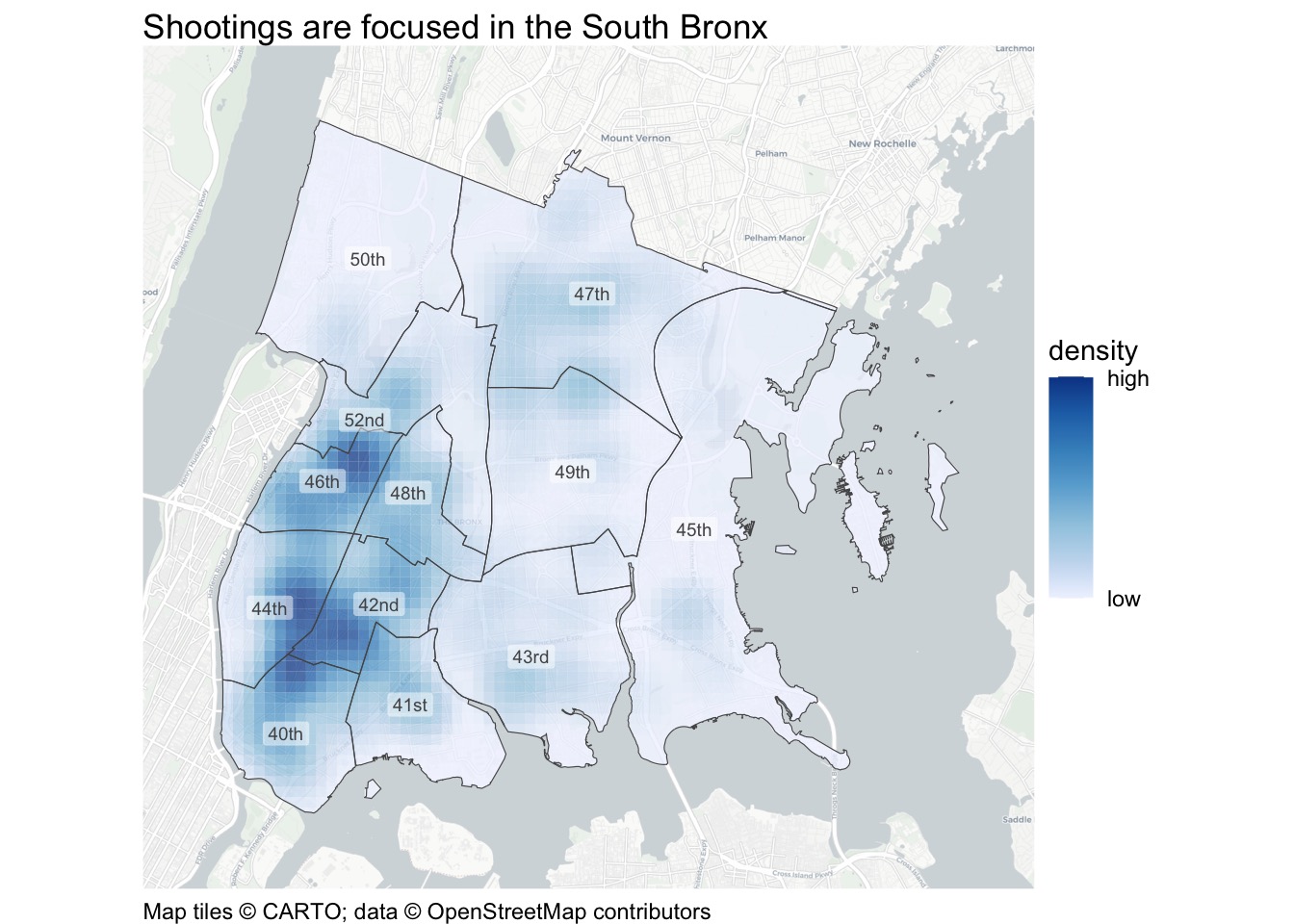
Sometimes our preferred title might be too long to fit on a map. In this case, we can break the title across two or more lines. We can do this manually by adding the characters \n (the character code for a new line) at the point where we want the text to start a new line. Alternatively, we can use the str_wrap() function from the stringr package to wrap the text automatically into lines of a given maximum length, specified using the width argument.
When you use a declarative title for your map, it is often useful to provide a subtitle containing descriptive information. Adding a subtitle is very easy using the subtitle argument to the labs() function.

7.8.2 Using captions to add author and other information
The title and subtitle arguments to the labs() function add information to the top of the map. That’s appropriate for information that we want to be particularly important, such as a declarative title that summarises the main point of the map. But we will often also need to add other information to that map that is important enough that we want to include it, but which we do not need to be as visually prominent. For example, we will usually want to specify who produced a particular map, what date it was produced, and where the data came from.
We could do this with the caption argument to the labs() function, which adds text below the map and in a smaller font size. However, hotspot_map() already adds a caption automatically, to fulfil the legal requirement to acknowledge the source of data used for the base map. If we used the caption argument of the labs() function, that automatically generated caption would be lost.
Instead, we can use the caption argument to the hotspot_map() function. When we do that, hotspot_map() will combine the caption we provide with the automatically generated caption, so that both appear below the map.
Run this code in the R Console. Note that we’re going to store the result in a new object called shootings_map_captioned so that we can use it later.
R Console
shootings_map_captioned <- hotspot_map(
  shootings_kde,
  basemap_type = "cartolight",
  caption = str_glue(
    "Author: Joe Bloggs, Date produced: {lubridate::today()},\n",
    "Data: NYC Open Data, https://data.cityofnewyork.us/d/833y-fsy8"
  )
) +
  # Add precinct boundaries
  geom_sf(data = precincts, colour = "grey33", fill = NA) +
  # Add precinct labels
  geom_sf_label(
    aes(label = scales::ordinal(precinct)),
    data = precincts,
    alpha = 0.5,
    colour = "grey33",
    fill = "white",
    size = 2.5,
    linewidth = NA
  ) +
  labs(
    title = "Shootings are focused in the South Bronx",
    subtitle = "Fatal and non-fatal shootings recorded by NYC Police, 2019"
  )
ImportantCreate your maps using a single stack
In this chapter we will store the map we are creating in an object several times as we go through the process of explaining how to add context to a map. When you write your own code, you should not do this. Instead, you should create the map from start to finish in a single block of code. Doing that will make sure your code is easy to read and that you don’t have to keep track of more objects than necessary. For an example of this, see the final section of this chapter.
The code for the caption also uses the str_glue() function from the stringr package. str_glue() glues together any number of character strings separated by commas – in this case, we have split the caption into two separate character strings (on separate lines) so that the lines of code do not become too long to easily read.
str_glue() can also include the values of R objects and the results of R functions that are placed inside braces ({}). So the code {lubridate::today()} runs the today() function from the lubridate package and glues the result (the current date) into the text.
7.8.3 Changing the legend title
Legends are important for all but the simplest crime maps because they help readers to interpret the points, lines and polygons used to represent data on a particular map. Except for point maps containing only a small number of crimes (such as the map of homicide in downtown Atlanta that we produced in Chapter 2), crime maps will almost always need a legend to help users interpret them.
Producing a legend manually could be quite complicated, but fortunately hotspot_map() produces legends automatically. But we might sometimes want to change the default legend title to provide more or different information.
We can change the default legend title by once again using the labs() function. Since we want to change the title of the legend, you might reasonably think that we would do this using something like labs(legend = "density") but unfortunately that code would do nothing at all. Instead, we have to set the legend title using the aesthetic (colour, size, shape, etc.) that the legend represents. This makes it possible to specify multiple titles if there are separate legends for different layers that use different aesthetics. For example if a map used lines of different colours to show streets of different types and filled polygons to show the density of crime, it would be possible to have separate legends explaining each aesthetic. In this case, we’ve specified that the kde column in the data should control the fill aesthetic, so we can set the title for that legend using fill = "title we want". We’ll do that in the next map below.
7.8.4 Changing the appearance of titles and captions
We have added a title, subtitle and caption to our map, but you might not be happy with their appearance. You might want, for example, to move the caption further down the visual hierarchy by making the text smaller and/or a lighter colour, or add some space between the subtitle and the map itself.
We can exercise almost complete control over the supporting elements of maps made with hotspot_map() using the theme() function from ggplot2.
Important
theme() doesn’t affect data elements
One important thing to remember about theme() is that it only controls the non-data elements of a map – nothing you do with the theme() function will have any effect on the data elements of a map (in this case, the layer showing the density of shootings). To change the appearance of data layers within hotspot_map() maps, use the geom_*() and scale_*() families of functions as we learned in Chapter 5 and Chapter 6.
The theme() function has a lot of potential arguments. If you need help using the theme() function (or any function in R) you can view a manual page (including a list of arguments) for the function by:
- typing a question mark followed by the function name without parentheses (e.g.
?theme) into the R Console; - typing the function name without parentheses into the search box in Positron’s Help panel; or
- clicking the function name in your R script, then pressing F1F1 on your keyboard.
Try opening the manual page for theme() now to see the list of possible arguments it can take. Fortunately, we will not need most of these arguments most of the time – ggplot2 has default values built in for every value that can be changed using theme(), and these defaults will be reasonable in almost all cases.
To reduce the visual prominence of the map caption, we can change the value of the plot.caption argument to theme(). Since the caption is a text element (rather than a polygon, line, etc.), we can use the helper function element_text() to do this. Code 7.8 changes the colour of the caption text to grey and makes the text smaller relative to the default using the helper function rel() (for relative sizing) – 0.8 means the text will be 80% as big as it would have been by default. The caption remains dark enough to read against the white background.
Let’s have a look at the effect of changing the caption’s appearance using theme():
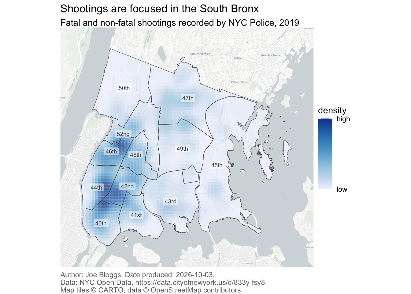
The helper function element_text() has arguments to control the appearance of text in different ways. As well as colour (or color, either is fine) and size:
familycontrols the font used, e.g. Times New Roman or Helvetica;facecontrols the style of the font, i.e. ‘plain’, ‘italic’, ‘bold’ or ‘bold.italic’;hjustcontrols the horizontal justification of the text, where 0 means left aligned, 0.5 means centred and 1 means right aligned;vjustcontrols the vertical justification;anglecontrols the angle (in degrees) of the text (0 means horizontal); andlineheightcontrols the space between lines if you have created a value that has more than one line (e.g. using\norstr_wrap()).
The margin argument controls the space around the text. It is easiest to specify the value of margin using the helper function margin() designed for that purpose. You specify the top, right, bottom and left margin separately in that order – to remember the order, think ‘trouble’. By default, margins are specified in points (the same units that are commonly used to specify font sizes).
Now that we have finished setting the text elements for our map, we can save it as a new object that we can use as the basis for the other objects we want to add. Make sure you run Code 7.9, since the remaining examples use the object it creates.
R Console
shootings_map_titled <- shootings_map_captioned +
  theme(
    # Make the plot subtitle smaller and adjust the margin around it
    plot.subtitle = element_text(size = rel(0.8), margin = margin(3, 0, 6, 0)),
    # Make the map caption smaller, left-aligned and grey
    plot.caption = element_text(colour = "grey45", size = rel(0.8), hjust = 0)
  )
QuizTitles, subtitles and captions
What is the main purpose of adding a title to a map in R?
Which R function is used to add a title to a map created with ggplot2?
Which of the following is an example of a declarative title for a crime map?
Why is it important to acknowledge the source of data used in crime maps?
What is the role of a legend on a map?
Why might we replace raw KDE values in the legend with the labels “lower” and “higher”?
7.9 Scales and north arrows
The final elements we can add to our map are a scale bar and a north arrow, which can both be added using functions from the ggspatial package. If you check the chapter_07.R code file, you will see that you have already loaded this package.
7.9.1 Scale bars
To add a scale bar, we can add a call to the annotation_scale() function to our existing map object.

The default scale bar is a little too visually dominant for the low place it should have in the visual hierarchy of our map, and the default placement in the bottom-left corner happens to overlap with the highest density of shootings. We can change the scale bar using arguments to the annotation_scale() function:
width_hint = 1 / 5changes the approximate proportion of the map width across which the scale bar stretches;style = "ticks"changes the scale bar to the less visually prominent line-and-tick-marks style; andlocation = "br"moves the scale bar to the bottom-right corner of the map.

7.9.2 North arrows
We can add a north arrow using the annotation_north_arrow() function. The default arrow is too obtrusive to fit its position in the visual hierarchy, so we will change its appearance using the arguments:
location = "tr"to move the north arrow to the top-right corner, since we have put the scale bar in the bottom-right where the north arrow would be placed by default;height = unit(1.5, "lines")to make the arrow smaller; andstyle = north_arrow_minimal(text_size = 8)to use a simpler arrow and reduce the font size (measured in points) of the N symbol.

ImportantNot all maps need north arrows
If a map is going to be used for navigation (e.g. a road map or a nautical chart), it is vital that the map includes a north arrow. But if the map is going to be used to understand concentrations of crime in an area, a north arrow is much less important.
You may choose to omit a north arrow from your crime maps. However, you must include one if north is not at the top of the map. People expect north to be at the top, so if your map does not follow this convention it is important to make the orientation clear.
Most of the crime maps in the rest of this book do not have north arrows, because those maps follow the convention of having north at the top of the map.
QuizScale bars and north arrows
Which of the following is a recommended practice when adding a north arrow or scale bar to a crime map?
What is the purpose of a scale bar in a crime map?
When should a north arrow be included on a crime map?
We will include the scale bar in the finished map because it helps readers judge distances. We will omit the north arrow because north is already at the top and this map is not intended for navigation.
We now have the complete code needed to make the full map. Copy this code into the chapter_07.R file, replacing the existing hotspot_map() stack.
chapter_07.R
# Create the map
shootings_map <- hotspot_map(
  shootings_kde,
  basemap_type = "cartolight",
  caption = str_glue(
    "Author: Joe Bloggs, Date produced: {lubridate::today()},\n",
    "Data: NYC Open Data, https://data.cityofnewyork.us/d/833y-fsy8"
  )
) +
  # Add precinct boundaries
  geom_sf(data = precincts, colour = "grey33", fill = NA) +
  # Add precinct labels
  geom_sf_label(
    aes(label = scales::ordinal(precinct)),
    data = precincts,
    alpha = 0.5,
    colour = "grey33",
    fill = "white",
    size = 2.5,
    linewidth = NA
  ) +
  # Add scale bar
  annotation_scale(width_hint = 1 / 5, style = "ticks", location = "br") +
  labs(
    title = "Shootings are focused in the South Bronx",
    subtitle = "Fatal and non-fatal shootings recorded by NYC Police, 2019",
    fill = "kernel density\nof shootings"
  ) +
  theme(
    # Make the plot subtitle smaller and adjust the margin around it
    plot.subtitle = element_text(size = rel(0.8), margin = margin(3, 0, 6, 0)),
    # Make the map caption smaller, left-aligned and grey
    plot.caption = element_text(colour = "grey45", size = rel(0.8), hjust = 0)
  )
This code looks quite complicated, but you can understand each part of it using the comments included in the code.
7.10 Saving maps
Until now, the maps we have produced have appeared in Positron’s Plots panel. But it is often useful to save a map as an image file so that you can share it with others or embed it into a report or presentation. You can save plots created with hotspot_map() using the ggsave() function.
ggsave() can create image files in many different formats, including PNG, JPEG and PDF. ggsave() will determine which type of file to create according to the file extension of the file name that you specify. So ggsave("bronx_shootings_2019.pdf", plot = shootings_map) produces a PDF file, while ggsave("bronx_shootings_2019.jpg", plot = shootings_map) produces a JPEG image file.
You can specify the size of the image that will be saved using the height and width arguments. Note that for historical reasons these values are in inches by default, but you can change this to either centimetres (using units = "cm"), millimetres (using units = "mm") or pixels (using units = "px").
To share our map with others, let’s save it as a square PDF. Add this code to the end of chapter_07.R.
The here() function creates the path to the output folder inside your crime mapping workspace. You can find bronx_shootings_2019.pdf in Positron’s Explorer panel and open it to check the saved map.
QuizSaving maps
How does ggsave() determine the type of file to create?
Why do we use here("output", "bronx_shootings_2019.pdf")?
7.11 In summary
In this chapter we explored how good map design begins with the map’s purpose and audience. Visual hierarchy helps readers identify the main message, while supporting elements provide the context needed to interpret the map. Remember that this map shows shootings recorded by the police: patterns can also reflect reporting and recording practices, and a density map does not explain why events happened.
We have practised how to:
- make map-design decisions based on purpose and audience;
- establish a clear visual hierarchy;
- add and format titles, subtitles and source captions;
- make legends clearer and less visually dominant;
- add scale bars and north arrows when appropriate; and
- save a completed map in the
outputfolder.
Your complete script should now look like this:
chapter_07.R
# This script adds contextual elements to a density map of shootings in the
# Bronx in 2019, then saves the finished map as a PDF.
# Load packages
pacman::p_load(ggspatial, here, httr2, sf, sfhotspot, tidyverse)
# Download the raw data
request(
"https://mpjashby.github.io/crimemappingdata/bronx_shootings.csv"
) |>
req_perform(path = here("data", "raw", "bronx_shootings.csv"))
request(
"https://mpjashby.github.io/crimemappingdata/nyc_precincts.gpkg"
) |>
req_perform(path = here("data", "raw", "nyc_precincts.gpkg"))
# Load shootings data and transform it to use an appropriate coordinate system
shootings <- here("data", "raw", "bronx_shootings.csv") |>
read_csv(show_col_types = FALSE) |>
st_as_sf(coords = c("longitude", "latitude"), crs = "EPSG:4326") |>
st_transform("EPSG:6538")
# Load NYC police precincts data
precincts <- here("data", "raw", "nyc_precincts.gpkg") |>
read_sf() |>
janitor::clean_names() |>
# Filter just those precincts that are in the Bronx (40th to 52nd)
filter(precinct %in% 40:52) |>
st_transform("EPSG:6538")
# Estimate density of shootings and clip the result to the Bronx precincts
shootings_kde <- shootings |>
hotspot_kde(
grid = hotspot_grid(precincts, cell_size = 200),
bandwidth_adjust = 0.33,
quiet = TRUE
) |>
hotspot_clip(precincts, quiet = TRUE)
# Create the map
shootings_map <- hotspot_map(
shootings_kde,
basemap_type = "cartolight",
caption = str_glue(
"Author: Joe Bloggs, Date produced: {lubridate::today()},\n",
"Data: NYC Open Data, https://data.cityofnewyork.us/d/833y-fsy8"
)
) +
# Add precinct boundaries
geom_sf(data = precincts, colour = "grey33", fill = NA) +
# Add precinct labels
geom_sf_label(
aes(label = scales::ordinal(precinct)),
data = precincts,
alpha = 0.5,
colour = "grey33",
fill = "white",
size = 2.5,
linewidth = NA
) +
# Add scale bar
annotation_scale(width_hint = 1 / 5, style = "ticks", location = "br") +
labs(
title = "Shootings are focused in the South Bronx",
subtitle = "Fatal and non-fatal shootings recorded by NYC Police, 2019",
fill = "kernel density\nof shootings"
) +
theme(
# Make the plot subtitle smaller and adjust the margin around it
plot.subtitle = element_text(size = rel(0.8), margin = margin(3, 0, 6, 0)),
# Make the map caption smaller, left-aligned and grey
plot.caption = element_text(colour = "grey45", size = rel(0.8), hjust = 0)
)
# Save the map
ggsave(
  here("output", "bronx_shootings_2019.pdf"),
  plot = shootings_map,
  width = 210,
  height = 210,
  units = "mm"
)
The script is in a logical order: it loads packages, downloads and prepares the data, estimates and clips density, creates the map, then saves the output. It includes the permanent code needed to repeat the analysis from the beginning.
Save chapter_07.R by pressing .
To check that the analysis is reproducible, restart R using the Restart R (⟳) button in Positron’s Console panel, then run the script from beginning to end.
Keep the script in the R folder, the downloaded source files in data/raw and the finished map in output.
We’ve now reached the end of the journey we started in Chapter 3 of learning all the skills needed to produce a good map of where a type of crime is concentrated. We have practised how to:
- load data from a variety of sources, select columns and filter rows (Chapter 3);
- create new columns in datasets, change existing columns and summarise groups of rows (Chapter 4);
- convert data to objects that can be used for mapping and use those objects to make a map (Chapter 5);
- estimate the density of crime in different places and show that on a map (Chapter 6); and
- add context to a map using titles, legends, scale bars and north arrows (this chapter).
From this point onwards, you will need to combine most or all of these skills for almost every map that you make. To help you make sure all your maps are good maps, you can use the checklist for producing a good map in Appendix B.
You can find out more about the topics we have covered in this chapter:
- For a short summary of research into how people read maps and what that tells us about how to design a map, see Cartography, visual perception and cognitive psychology by Amy Griffin.
- For a more-detailed explanation of how visual hierarchy can be applied to maps, see Visual Hierarchy and Layout.
- For more examples of how maps can mislead, read How to lie with maps by Alan Smith. UCL students can access the Financial Times through the library.
QuizRevision questions
Answer these questions to check you have understood the main points covered in this chapter. Write between 50 and 100 words to answer each question.
- What is visual hierarchy in mapping, and why is it important to establish one when designing a map? Provide an example of how visual hierarchy affects map readability.
- Why is it important to add titles, legends, and other supporting elements to a crime map? How do these elements enhance the map’s usefulness and clarity?
- What is the difference between a descriptive and a declarative map title? Provide an example of each for a map showing crime patterns.
- Why is it important to acknowledge data sources and authorship on your map? How can the
captionargument inlabs()be used to include this information? - What factors should you consider when deciding whether to include a scale bar or north arrow on your map? How do these elements contribute to the map’s context?